one thing i may note is it does appear a bit flat. ifn you could have had a bit or raking light showing the depth and warmth of a low sun this would have totally rocked.
i love the composition and the tones. just that bit about the light.
I think you captured it perfectly. Any more contrast or brightness then it's artifical, you have done well in capturing the colors and contrast very realistically. Well done!
Sorry to get to this so late - I'm aware you've reedited as per everyone else's advice, but I've tried not to read the other comments til i've left my own..
My first impressions are that you've found a great POV to give a really photogenic composition, but that the lighting/editing make it look a little blander, detracting from its potential. The non-symettry of the curves, leading you down to the main doorway work really well, echoed by the shadows on the ground doing the same thing, but I still feel the doorway is a bit too central - I'd maybe crop it a bit tighter at the bottom.
In terms of editing, it needs a bit more 'punch' - more contrast, work on curves etc. Depending on the location, it may be really photogenic in early morning/evening, where you'd get soft but distinct shadows, warm colours and lose the washed-out feel.
Trading Post -
Nice shot here Deb. Great curves, textures and colors. More contrast thorugh levels or curves to bring the lighting down would be very nice. Make it a bit moodier. I think I saw your Advanced Edited shot and that was very nice. You have some cool locations to take pics of. Well done.
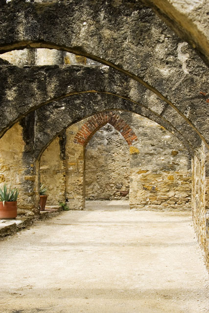
nice image, probably a very spiritual place, but it doesn't show in the photo, lighting and focus is good, but I think the composition would have been better if the doorway in the end eould have been to the far right in the image and not in the center, that way you would have shown more of the flowers and in to the arches where they are.
I think the floor area in this photo is a bit washed out. I think a bit more darkening would have solved that and given the whole picture more crispness. I might have cropped out the little piece in the upper right hand corner because my eye keeps going up there and that is not the focal point of the photo. Composition is otherwise excellent. The colors are good, the subject matter is intriguing, and the photo has even more potential. Judging by the scores, I think I might be more critical than most voters who seem to like it even more.
Trading post...
WOW! Excellent angles! This really seems to draw you in. The colors are excellent and I love the softness that comes from the dark contrast to the light. The only thing I could think of to improve this would be maybe taking one step further in to eliminate that small light spot in the top right corner (my right looking in).
The wonderful view of those arches make this picture great. You've selected a great composition using them, and the central doorway arching up into the composition from below really gives it a great feel. It might have been best to shoot "up" more, avoiding a lot of the ground, which is likely too flat and unintersting for this image. It could be said that the ground is a nice contrast to the way the image is composed above. A great photograph, congratulations.
Nice finish with this one. I like your composition choice here, but the lighting seems a bit off. I copied this one and looked at some possible adjustments. I tweaked the curves just a bit with an S shape and it did wonders for the darks in the photo. It gave it some much needed contrast. Very nice capture, and with a little work would ahve surely drawn a 6+.
This is a beautiful, historic photo! The ligthing is perfect, and the detail on that old, old brick work is amazing! I love the fresh potted plants to add an element of surprise. This is very much one of my favorites here!!!







 Add photograph to your favorites
 Add photographer to your favorites


 Photographer found comment helpful.


