Well, where to start? The first impression of this image is incredibly powerful and really makes one feel like they're there. Judging from your other highly rated photographs I see that this photo is in line with your perfected technique for capturing landscapes and outdoor, natural scenes. You also certainly handle your Olympus well, with sound settings from depth of field to your aperture.
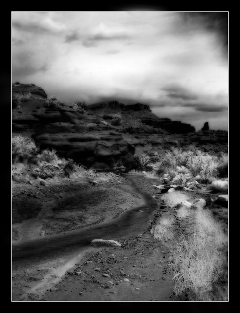
Unfortunately, and as stated earlier by other commenters, some of your DOF is lost in your post processing. I'm completely with you on burning a few features to help bring them out and it all works incredibly effectively to produce such a great image, but your dodging and glow action has lost a few details that cause the eyes to squint and keep adjusting when trying to focus, and so the only part of the photo that we see really clearly is the closest part at the bottom of the path.
Your choice of colour and contrast compliment this photograph exceptionally well and the overcast sky add to the dramatic lighting that really accents the shadows and dark edges of the features.
As for the title, the scene seems very fitting except, for me, the word 'curse'. There seems to be very little in the image to suggest any kind of curse apart from the slightly sinister darkness in the background. To me, just Desolation Point would seem fine.
Why this image didn't get at least into the 6s is a bit of a mystery to me. I think that the relevance to the competition might be a little off as I've noticed that some of the higher-rated images tend to be much more easy to visualise on an actual screen, although your image looks very fitting for a poster. I think the only real downside was the general blurriness throughout the image, apart from that the border and PP works perfectly!
Unlucky on a slightly disappointing rating for such a great photo and the best of luck for future competitions!
I thought this could be Southern Utah, we missed meeting you at the GTG, although I understand you have a very important deadline to meet these days, all my best!! To the next GTG in the SLC area.
Very pretty. Love the title. Would be interesting to see a human element in the image, maybe a long shadow or dark silhouette (something left behind), demonstrating the threat of the curse.
looks like lots of noise reduction is applied here, or could it be Gaussian blur? I like the dramatic sky and clouds. Good choice converting this into black & white.
I like the title and the image. I'm wondering if it being so "soft" hurts it a bit, as that doesn't look as much like a movie poster as it would if it were more tack sharp. The leading line and all of the various hues from white to black, showcase the landscape well. Is that a person lying in the road? If so, I think he needs to be larger to really be impactful. But overall, better than most in this challenge, as it suits a movie both visually and in text. 7






 Add photograph to your favorites
 Add photographer to your favorites

 Photographer found comment helpful.


