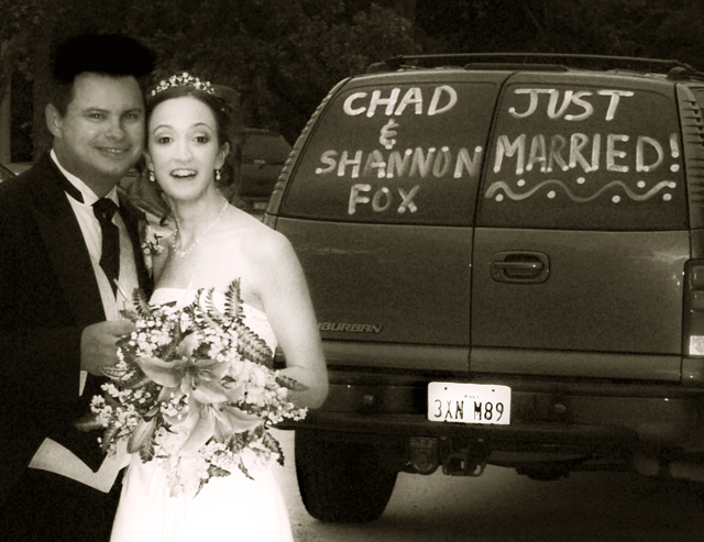
Title is stretching it I know.. anyhoo the vitals:
cropped, converted to duotone, dodging and burning,
a little gaussian blur and noise and who knows what else...
Statistics
Place: 192 out of 207 Avg (all users): 4.5567 Avg (commenters): 3.5000 Avg (participants): 4.2255 Avg (non-participants): 4.8911 Views since voting: 825 Views during voting: 319 Votes: 203 Comments: 9 Favorites: 0
Something doesn't look right with his hair. It's as almost someone burned some hair into his head and a sloppy one at that too. The noise and grain is distracting as well.
you did some editing on his hair? looks pretty weird... I think your monitor might be too dark if you can't see it. at the bottom of the voting screen there is a b&w bar- you should be able to distinguish all the black boxes. check it out :0) the soft glow is nice. good photo, just not exactly a movie poster
Having a bit of a hard time with this one...her face is off - too bright/blurry or the combination makes it appear almost featureless. He is lost into the background. The main focus seems to be the back of the truck which also has some problems - grain, blown out plate. Then the title...seeing as how this was mentioned in the challenge description specifically, this is being shoe-horned in as it really isn't three words but two with one of them being split to fit.
Weddings & films = good combo. But your flash appears to have gone a little haywire - he and she appear to be totally different shades and distractingly so. Her dress is blown out. I would recommend dialling down the flash for wedding shots and all that white. You might want to have a go at dodging and burning in PS - you may have been able to fix some of the odd shading in post processing (eg the numberplate needs to be burnt so that it is not so distracting).




 Add photograph to your favorites
 Add photographer to your favorites


 Photographer found comment helpful.


