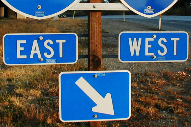
The quotation I should have referenced more directly is "East is East and West is West and the twain shall never meet." I later figured out I should have titled it either "The Twain Meet Here" or "Twain Station." I'd also had an idea to add on a hand-lettered sign reading "Welcome Tourists!" but fogot to take the materials with me for that. If we were allowed non-standard crops I would have taken off the bottoms of the highway number signs, but I guess I was trying to "disguise" the actual location -- maybe I should have just included the whole sign.
Sorry, not getting the joke. This looks like it could use a little sharpening to bring out a crisp focus. The bottoms of the two interstate signs at the top of the screen are distracting. Since I don't get the joke, I'm hesitant to suggest any alternative crops.
Nice crisp colors and framing, though maybe tilted a little. My only suggestion would be to crop the bottom of the interstate signs at the top out leaving just East West and arrow. karmat
I like the color in this photo but I wish the depth of field was a little more shallow to blur out the background.. I would have also attempted to shoot this sign straight on to eliminate the perspective tilt... = 6 - jmsetzler
I dont get the Kipling was wrong title. also I dont look at the title when judging the pictures. its afterall the picture that is being judged. Since the title obviously ties it together and though I read alot kipling isnt a favorite. the extra chopped portion of the shields at the top is a distraction






 Add photograph to your favorites
 Add photographer to your favorites


