This shot burns the eyes, yeah?;p
It doesn't really fit that well in this particular challenge but still, it's a nice cityscape.
Wouldn't have the composition any other way, ang I guess a little sharpening wouldn't've hurt. Nice sky as well.
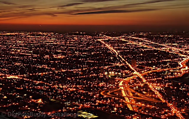
"Dusky Pulsating City" is a very attention grabbing entry into the DPC Cinema challenge.
The first thing that grabs my attention is the bright city lights. You did an excellent job capturing the colors of the lights in balance to the sunset. Unfortunately the some of the brighter lights draw attention to the focus being a little off, possibly the camera was bumped. I think if the clarity was stronger it would have helped the score.
It was interesting to see more of a landscape shot not in the long length way most shots are done. I think if you had gone with a longer width you might have lost the interesting greenish building down towards the bottom.
I think this challenge was a little harder because voters, like myself but a little more emphasis on the subject. I personally looked at the shots for the photographic quality and also the believability as a movie. Your was more interesting as a movie because of the title you gave it, so defiantly good work on the title.
Overall nice work and I look forward to your future entries.
Iim not sure this works for a movie poster.
Otherwise I thinkits stunning!! The horizon is nice and a good use of rule of thirds. The colours are beutiful and the orange contrasts the black well:)
I think the only thing that effected your score is that it doesn't really look like a movie poster.
My first impression was, it's a nice aerial shot but it didn't have enough going for it to do better in this particular challenge. Compositionally, it works. I like the horizon and the main highways being off center. In terms of the technicals in general, not much to critique here. You captured the dusky feel nicely and there are no distractions or anything like that present.
The choice in subject is what I feel held you back. What this fictional movie needed in my opinion was more identifying marks of the city. Here we see a city sprawl that could be any city. Maybe a skyline shot of downtown would have worked better giving a face to the city and the movie.
In terms of improvements, I just think having a stronger more identifible subject would have really helped. As is this is a very nice aerial that probably would have done better in the Night challenge.
Hey Shail, nice entry! I haven't read the comments you received, so mine are completely uninfluenced. When I first looked at this, I thought it was smaller than the 640 px allowed, but checked and see that it is that in width. So here comes my tip: I've noticed that my scores have gone up in general by between 0.5 and 1 point since I've started to make both dimmensions wider. So I think if you had made the vertical 30-50 pixels wider, it would've helped your score. The shot itself is really good for a movie poster, imo. You've got some nice colors going on and I like the comp. The lights look a little blurry, but one could say that the blurriness adds life to the shot. (probably the voters don't think so, though :-) Amazing sunset!
For this challenge, specifically, I think your photo took a hit for the landscape orientation, which was hotly debated in the forums. Also, the title is awkward and doesn't really suggest a movie title so much as a description of what I'm looking at.
As to the photo itself, there are a few things I see. First is the greenish-gray patch at the bottom center. Since it's not in the same tonal range as the rest of the photo it is a distraction. Instead of wondering about the movie, I'm trying to figure out what that particular feature is. (A parking lot, I think.) I would definitely crop that out. There's also a little bit of contrail in the sky (in the dark part in the left quarter of the scene) that could have been cloned out. Also, the lights seem to be a little over exposed, and the effect is that they actually seem a bit pixelated.
This might have been an interesting movie lead-in if the city were a less common color, say, adjusting the hue or color balance into blue, purple, or green, to give it some intrigue, but I somehow doubt that modification would have been well-received amongst the voters - I get the impression that anything that looked too processed really lost out in this challenge.
My feeling is that for this kind of panoramic overview shot, you need a stronger - much stronger - sense of the fine detail; aside from that, your composition is strong - those highways or whatever really lead the eye through the image, and there's a nice sense of increasing complexity towards the horizon.
I think the colors in this shot are not doing justice to the actual view seen by the eye. Everything came out looking shades of yellow when the actual city lights are much more varied than that. Subtle, but still full of blues, reds, greens, etc. The sunset also makes me think your capture or PP is cheating you on the richness and saturation that is available. Night shots are tough to capture well and tricky to process, but the rewards are worth the effort.
Compositionally, I think this shot will not please voters as much as some other cityscapes because it lacks a natural focus point for the eye to rest on or return to. The train line and highways leading off to the upper left help, but are not enough to carry the composition by themselves. You were hemmed in by your desire to capture the sunset, and the fact that the direction of NW contained no larger lit buildings to provide a focal point.








 Add photograph to your favorites
 Add photographer to your favorites

 Photographer found comment helpful.


