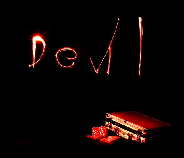
I like the idea and the execution came out very well. The lighting is well done and the composition works. I also like the red contrasted against the black, which is very devilish in nature. So really there's nothing technically wrong here.
My only suggestion would be to have a stronger subject to depict the devil. I think the text could work but there needs to be more. Perhaps have something in the background that fills space. For example, a dimmed image of fire as a backdrop with the letters painted over it? I found this graphic online of a burst of flame. When I blend this over your photo (Screen mode) it roughly illustrates what I am envisioning here. Anyway, just a thought.
Edited to fix link. The link will take you to a google search. That first image of a burst of flame is what I am talking about. Unfortunately it won't let me link to it directly.
I like the idea. the poker stuff in the corner really works for me. the light could have been better but I understand how tough it can be. focus seems soft on the poker stuff but over all good idea.
I think this would work better without the lettering. Not that it is too bad, but I feel it doesn't add anything to the image. Also, I think the subject should be a little more in evidence (closer).
Awesome shot; great dramatic interlude of blackness; The only thing is, the devil needs to write in a scary confident way; not like a 6 year old who just learned cursive writing.






 Add photograph to your favorites
 Add photographer to your favorites

 Photographer found comment helpful.


