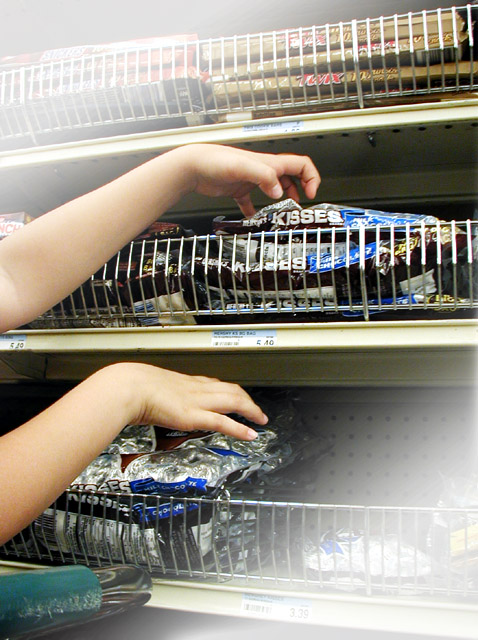
Handheld in the store under fluorescent lights. Corners faded to provide space for type -- see this link for a version with sample type added:
//dpchallenge.com/image.php?IMAGE_ID=331351
-RGB Curve
-Created diagonal mask in alpha channel
-RGB Curve through mask to fade corners
-RGB Curve through mask to fade corners (repeat application)
-Resize for DPC
-USM at 12%/48 dia/TH = 0
-SaveAs JPEG at quality 7/10 = 119kb
Statistics
Place: 194 out of 207 Avg (all users): 4.4819 Avg (commenters): 3.5000 Avg (participants): 4.2088 Avg (non-participants): 4.7255 Views since voting: 1086 Views during voting: 307 Votes: 193 Comments: 7 Favorites: 0
If text would've been allowed you'd have definitely got a better reception here. Your post challenge shot was well done.
The idea is really creative. Driving Pop Crazy was an excellent choice and I like how you incorporated that shopping cart buggy to get it across. I'm guessing you know what hurt you: the faded corners you left to insert the text. Most people, myself included, would've never considered that adding text was what it was for and probably voted it down wondering what the heck the photographer was thinking to post process an image like this. I didn't vote in this challenge but would've done the same thing.
Like I said, overall a great idea.
Thanks for the opportunity to critique this image!
I come from a graphic design background, so I was planning for the added type, as well as isolating the arms and reducing some of the clutter of the BG.
Here's an example of how the finished poster might look:






 Add photograph to your favorites
 Add photographer to your favorites

 Photographer found comment helpful.


