A documentary about the ever-growing problem of children living in poverty worldwide.
I will probably be relegated to the low 5s for this one, but my kids were awesome as models for me today and I had so many good shots to choose from that I couldn't make a decision! :)
Statistics
Place: 45 out of 207 Avg (all users): 6.0955 Avg (commenters): 6.3750 Avg (participants): 5.8958 Avg (non-participants): 6.2816 Views since voting: 5659 Views during voting: 308 Votes: 199 Comments: 15 Favorites: 4 (view)
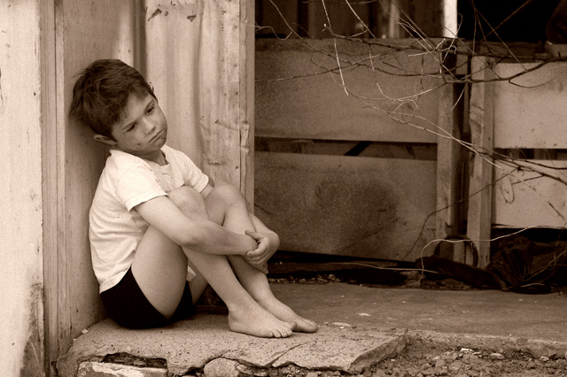
This photo scored rather well in the challenge and doesn't require much of a critique, but I have a possibly interesting point to offer you. Your choice of sepia toning on this photo may not have been the best option. Sepia toning achieves two effects, for the most part. 1 - it creates an antique feel and 2 - it creates warmth in the image. Neither of these two themes seem to be representative of your theme for this photo. Your photo represents something current, which wipes out the antiuqe nature of the sepia. Warmth and poverty aren't usually associated with each other either.
When you choose a post processing option, be sure to think about 'why' you are doing it. "It Looks Good" is often a valid enough reason, but determining "why" will help you grow :)
VERY well done!!! I'm surprised this didn't score higher. It is a powerful, beautiful photo! Yes. .your little model deserves a blue ribbon in my book :)
Oh what a charming portrait... I can imagine this image used to advertise a gritty film such as Angela's Ashes or the like - a film based on a story of a hard life. I like the pose and composition - with the negative space. The image overall feels a bit soft to me and the brightness of the sleeve area draws my focus away from his face. I am not keen on the distracting branches/ wires either. But overall I think the mood comes through well.
He looks poor, but not desperate. Still, you're engaging the reader with a sympathetic character. So it's not a big draw, but it's a draw. And he's framed nicely, too. An overall good composition, with the option of putting text on the right.
Great title, a nicely taken shot... but I just can't help feel that this is a staged shot. That is the only thing that bring it down for me. Good work all the same.






 Add photograph to your favorites
 Add photographer to your favorites

 Photographer found comment helpful.


