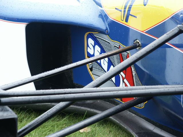
1. Overexposed. 2. Lacks contrast 3. Needs more color saturation. 4. The grass does not fit. 5. The rain drops detract from the image. The choice of angles is mystifying. The would have been better with more of the paint and bright colors.
Good colors and focus. It seems a little weighted to the right to me, though, and i don't know why. Maybe it is the white area on the left. Really can't offer a way to correct it. Sorry.
has good possibilities in composition but the horizontal rod on the bottom half is cutting the visual; top part is blown out a bit - maybe a burning in; has potential for being a sharp industrial type photo
a new twist on F1 - british grand prix ? Not sure if this really does much for me though - doesn't really isolate enough/ show something clearly. What's the message ?
nice sharp shot, good colors, but those bars (i know they are part of the race car) are pretty distracting to me. so is that leaf underneath the bottom one (nitpicky, i know, but the hard part is usually to control the small details in the background). -- gr8photos (3)
Cool shot... I love F1! I think you should have shown more of the car though, and it would have been nice if it wasnt sitting on grass... F1 cars arent supposed to be in the grass! :)






 Add photograph to your favorites
 Add photographer to your favorites


