CTP II, yeah.
Heh, your subject's a dork.;-p
Not movie poster material, though. It's more along the lines of propaganda material.;-p
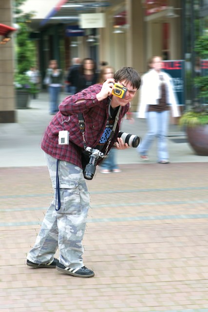
Not really against the faked motion blur, just control and tighten that selection. The sloppy application of blur doesn't do your photo wonders.
Hey, at least it's not a snapshot anymore. Yeah.
I like the idea. Very over the top with the number of cameras and badges he has on. For some reason perhaps due to the blur and him tilting forward, I keep thinking he's on rollerblades when he's not. If this is someone you know maybe if you decide to reshoot this idea in the future have him wear a pair of rollerblades. If you do that try out some landscape framing with him off-center to really enhance that motion and crazy feel to this subject. Or go really crazy with the composition (diagonally lined subject) to really play up the crazy theme.
In terms of the technicals, I like the choice in blurring the background a bit. However, as gazdi said, make that selection a bit tighter to avoid those sharp patches left behind. I know sometimes I make those same mistakes. It usually happens when I am too caught up in a differet part of the image trying to fix that I don't notice other things wrong. What I find helpful is to allow enough time before the deadline to revisit my edited entry so that I have a fresh pair of eyes looking at the photo and a lot of times I end up re-editing it to good results.
Other things to consider in terms of improvement would be contrast and sharpening boosts. I think there is room for more of that here. The main thing I would probably do here is make the blacks a tad blacker either by using curves or selective color if you use photoshop.
Overall, I like what you captured. The subject has very good detail and is sharp as is.
First Impression: My first impression was, I've commented this photo before. Then realized was another one with same title...LOL. The first impression is "that boy has too many cameras".
Composition: Good, but would have improved IMO if you cropped tighter to the boy on the left.
Subject: Nice, as this was a very difficult challenge IMO.
Technical: You achieve a really good DOF with your subject on focus and the BG blurred. the colors are a bit washed, I would liked more saturated colors.
Improvement: More contrasted colors, there's a bit of halo around the boy
I like the motion blur. The thing that struck me was if the model had different colour trousers on he would stand out more from the pavement. (If he were on rolor blades it would seem more wacky)
I think this was one of the best takes on the "Driving People Crazy" title that so many people used in this challenge. Unfortunately, the fact that so many people did use it probably hurt the score. Like I told Gunnsi, it was purely luck of the draw on that. Clever the first time you see it, less so upon the fifth entry with the same theme.
On a photo like this, tracking is very important. The subject should be completely in focus while the motion of the background/other surroundings is intact. It's a technique that a lot of nature photographers really work on a lot. Best example I've ever seen is here: Don Grall's Hummingbird - Maybe not the crystal clear I was talking about, but if he can do this with a hummingbird, imagine what can be done with humans who don't move anywhere near as fast!
Also, there are some blown highlights on the pants and the tape recorder. The woman in the white jacket in the background is a distraction simply for the brightness of her clothing, I might had tried to wait until she passed and the other pedestrians were more neutral. The scene overall looks a little too bright - especially the sidewalk.
Cool idea but the realisation lacks care in fields of camera handling (ghost images), composition (it's simply centered and also should have been rotated to horizontal) and PS skills (selection especially around the legs is simply poor).







 Add photograph to your favorites
 Add photographer to your favorites

 Photographer found comment helpful.


