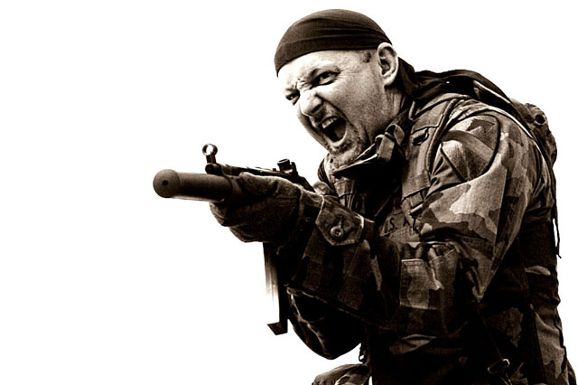
I'll probably getting hit for the phonetics and maybe the landscape orientation, but oh well. At least I won't get voted down because the photo is too sexy! Although the 'model' wouldn't mind that, I'm sure. Ha!
___
Wow. Thanks for letting me know that the title is way more important than the actual photograph, I appreciate it, DPC!
Statistics
Place: 62 out of 207 Avg (all users): 5.9000 Avg (commenters): 6.1364 Avg (participants): 5.6915 Avg (non-participants): 6.0849 Views since voting: 1810 Views during voting: 342 Votes: 200 Comments: 26 Favorites: 1 (view)
A stretch on the title but this is an outstanding photograph. Plenty of white space for text makes this work even though the landscape orientation is very unusual for a movie poster.
You did a great job of photographing this shot - your model is perfect with his facial expression and his body language. The title, well.. it has less impact than you well done shot.
One of the few that could be an actual movie poster. My compliments on the comp and original title. Not to mention the great expression of your model. Perhaps a polarized lens or a less extreme cuves adjustment would help with some of the washed out areas. (forehead and clip)Still, one of my top scorers for the comp.
I thought a "ph" would be cool, I'm almost phinished voting and this is the phirst I've come across. I like the unyielding quality of your image as well.
Ah c'mon...Phorce? Surely you could have come up with something better than that - how about 'Platoon' for example. Good pic tho and would work very well as a poster.
Like the high key approach to this movie poster photo, you balanced it well with just the right amount of negative space. I think I definately undervalued this one on the first pass through. Very nice!






 Add photograph to your favorites
 Add photographer to your favorites


 Photographer found comment helpful.


