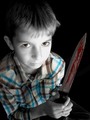
Not a bad movie poster. You even have the right orientation! You need a little more room somewhere though for the title and all the crap they have to put on a movie poster...
TC
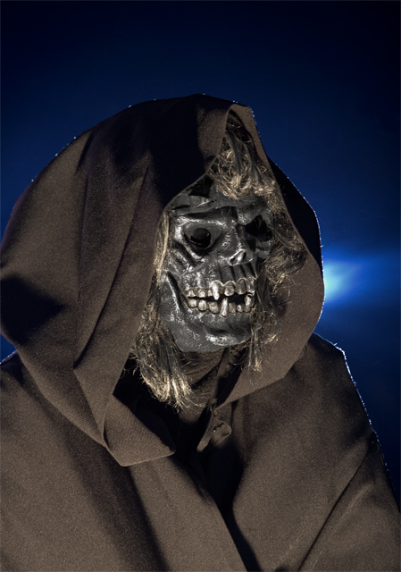
I thnk that this could be scarier with some different lighting - It needs a torchlight facing up from below! The blacks need to be closer to black, and the pool of light should pick out the subject, rather than giving a full frontal. Good backlightingm, though!
I don't like the lint highlights, and the picture is too static. Shouldn't this prophet be doing or saying something? He looks too much like a guy in a rubber mask.






 Add photograph to your favorites
 Add photographer to your favorites


 Photographer found comment helpful.


