Thanks once again to my very patient fiancè for tolerating my antics :)
*Edit Post Challenge*
(Venting starts)
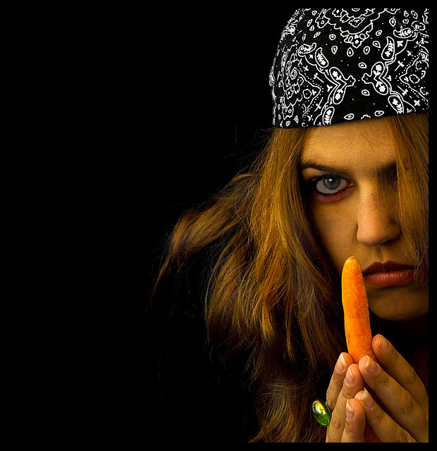
Mmmhh... To those asking why my model looks possessed and not the carrot - if I had wanted the entry to be so literal, I honestly wouldn't have bothered entering. I'm actually kinda taken aback by these literal requests or queries.
As an example, Did Bilbo's ring in Lord of the Rings "look possessed" at all? Or "evil" for that matter? Dont think so. It was just a gold band throughout. But we all know what happens to the one who wears it, dont we? And if you havent seen it, or read the book, think of it rationally a little.
Anyhow, kudos to those who voted without expecting little demon horns on the carrot with a super-smiling model and could actually see my intentions for what they were.
I'm not angry about my score, in fact, I am very happy to have a 5.8 in my second-ever member's entry. I just had enough of these single-minded comments and views...
(Venting over.)
Statistics
Place: 65 out of 207 Avg (all users): 5.8600 Avg (commenters): 6.7857 Avg (participants): 5.7604 Avg (non-participants): 5.9519 Views since voting: 1016 Views during voting: 330 Votes: 200 Comments: 21 Favorites: 0
I loved this, thought it was very funny! By the way, your fiancè and my friend Carrie look very much alike... I made her look this photo up during voting- she even thought so & was suprized! :0) (my DPCinema entry...)
The reason I chose this crop, was that I wanted "Diana" to appear almost withdrawn, which is how I would kind of imagine a sinister person to be. I disagree that the carrot had to take center stage, that would make it too obvious?
This movie, in it's totally ridiculous form, wouldve been about DIANA and HER POSSESSED CARROT. Thats why the carrot isnt singled out. I still believe the 'subtlety' of the carrot in this pic makes it even more sinister in a sense.
Thinking out of the box here - looking at Diana... would you take that carrot from her? To me logically - if a "possessed" object was in the hands of a madwoman (Diana), my mind automaticaaly says that the carrot makes her evil.
BUT, this movie is about Diana and what she does with her possessed carrot, so no reason to single out the Carrot. Diana and the word Carrot is in the title after all, so they go hand-in-hand.
He he he... anyhow, like Bear_music said to me, i'm overreacting and this is just a lesson I have to learn about how to think next time. :)
Thanks for the input though eschelar, I really appreciate it!
Ok, please don't take this as a 'narrow minded comment' because I am pretty open here. I used to write some small time fantasy fiction for a couple of sites on the net...
I am going to say that I found the pic hard to vote on because the subject of the title did not match the subject of the photo.
I looked at a lot of things in this pic, including the lighting, the composition, the makeup, the lines, the colors, and in the end, I couldn't come up with a vote. I skipped it. I don't do this very often at all.
What I think might be the issue rather than the 'possessed' quality of the carrot is the balance between your two subjects. I think you have tried to balance them a bit too much. The picture seems to be about as much about 'Diana' as it is about the carrot...
The title is worded in such a way that the carrot should take center stage and the model should be playing second fiddle.
There are a few different ways that could have been accomplished. I would probably have gone for either DOF or Lighting to shift the balance ever so slightly towards the carrot.
Perhaps pushing the saturation a bit on the carrot and darkening everything else a bit might keep the picture as is, but make it more suited to the title.
good job on the cropping - the model has an interesting face/expression - please share how the carrot acts out its possessed state :) because, the model looks more p[ossessed than the carrot. well done
You win. I have to buy tickets now just to see what she does with that carrot. Good job. Good composition (I've been finding that "unbalanced" compositions work best for movie posters), good color and light, good expression from the model.
I like the composition, and the lighting. Color looks a bit orange all over (but perhaps you did that on purpose). Not sure of the title - seems a bit of a streatch.





 Add photograph to your favorites
 Add photographer to your favorites

 Photographer found comment helpful.


