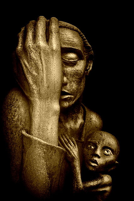
Unfortunatley I didn't have any models/actors so I used statues instead. :)
I wanted to capture as little of the background as possible so I underexposed the shot to the point where there was just a ghost figure seen on the LCD screen. Noise wasn't an issue so this worked out well. I did end up throwing some fill flash on the subject since I wasn't capturing enough light at first.
The goal was to get a dark/edgy cinema look for this ScFi type of movie. I think I accomplished that but I have no idea how this will do.
*Post*
I should have probably labeled it SciFi in the title. Oh well.
Statistics
Place: 77 out of 207 Avg (all users): 5.7960 Avg (commenters): 7.2727 Avg (participants): 5.5417 Avg (non-participants): 6.0286 Views since voting: 1342 Views during voting: 409 Votes: 201 Comments: 22 Favorites: 2 (view)
This one goes to my favourites, the main reason being the great choice of subject. I may be biased here, but I'm a sucker for such sculptures. Enter it in whatever challenge, even Landscape, and I'll give it a 10 -- as long as it's open (gray shirt sucks). To give the photographer credit, the exposure's perfect and cropping's juuust right, if not a liiittle bit too much at the top and left.
Great job, Mr. Toro.
First Impression Very nice lighting and emotive shot.
Composition: Very good composition. I really like the tighter corp.
Subject: I like the subject. Only reason I can think of someone scoring it low is literal representation of art. I personally don't think that way though.
Technical (Colour and light): Just wonderful, the lighting in particular.
Improvement: Technically can't think of any improvement. The selection of the subect can be considered as one of the only suggestion for improvement. But than this was very tricky challenge.
Summary: Really nice image. The lighting and the exposure is spot on.
What can I say... wow! This is a fantastic shot. great, exposure adn perfect focus. I really like the mood here. Not sure that I would do anything differnt, really. Like everything from the cop to the title. Well done.
peace
rooster
CTCP2 Gunnsi First impression: Picture of artwork.
Good picture: good focus, good contrast, good lighting but I don't like the subject.
"Artwork: Literal photographic representations of existing works of art (including your own) are not considered acceptable submissions, however creative depictions or interpretations are permissible. This includes, but is not limited to paintings, sculptures....,"
What could be better:
1. This is a perfect picture of an existing arwork, nothing can be done better there.
2. Pick something else to photgraph.
Composition: Very good, with the mother on the very left and the free space on the up-right.
Subject: Really good for the challenge IMO. It really seems a movie poster to me. Maybe the complication of the title should include DPC was a detracting for the score. I think that in a movie poster challenge with free title you'll have scored much better.
Technical: wonderful tones and texture oof the statues. The black BG you achieved is also great. Good focus.
I like the statue - they look almost like aliens. nice touch. And the dark background works really well. Ligthing/fucus etc. are good. The title is a little 'heavy'. The 'average guy' probably doesn't know what preponderant means.
All in all a good shot.
My first impression, of this as a movie:
"Preponderant? What movie exec let that one through?" Seriously, I know this isn't really a titling challenge, but you have two very difficult words in the same title, and that's not going to put butts in the seats. Maybe "Problem" would have worked better?
The image itself fits a movie poster well enough. Perhaps some more dramatic shadowing to make it look less like the Mayan exhibit at the Natural History Museum. I'm not sure that labeling it "sci-fi" would have done anything but cause further confusion. I definitely don't think it would have helped any.
Strictly as a photo, I don't have any problems with this. The framing is good, the shadow and exposure are good. It doesn't look crisply in focus, but I think that's a fault of the stone texture, not of the photography since the edges look clean. I think this was a good finish for such a chaotic vote.






 Add photograph to your favorites
 Add photographer to your favorites

 Photographer found comment helpful.


