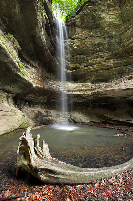
First of all I would like to congratulate you on an incredible shot and a very good score! This shot begs for the what I like/don't like treatment so that's how we'll proceed.
What I like: You have an incredible set of lines in this shot. Most of the lines are arcs that start at the opening of the waterfall and build up as you move down the scene ending with the log at the bottom of this scene. There is one arc that goes agains the rest towards the bottom (the top edge as seen of the pool) to give a contrast. This alone is worthy of a decent shot. But then you add in the vertical line of the water fall that in itself is a subtle arc. This last line adds another contrast. The combination of these lines is a very subtle draw of your eye from the top of the shot to the bottom. You also have a very simple color sceme consisting mostly of very nuetral colors, browns and greys. This is broken up, once again, by the waterfall itself. It's also broken up with the little splotches of green. These almost look oversatured but that is because it is a contrast against the neutrality of the rest of the shot. Then there is the waterfall itself. It starts out at the top as a solid set of white lines. Then as you move down towards the pool at the bottom, these lines become almost ghostly. Put these elements together and you have a very nice shot.
What I don't like: There is almost nothing to put into this category. In fact there is really only a question. What would this scene look like without the distortion of the wideness of the lens (that I assume) you used here. Did the log really have that curve? Are the walls of the cave really that curved? Does it really matter? I can't tell without standing next to you as you peruse this awesome scenery!
what I am looking for in this challenge is for a creative 'wow' shot that would go on a movie poster. I think that's what the challenge is all about...I am not sure this one would attract too many cinema goers...sorry...great photo though






 Add photograph to your favorites
 Add photographer to your favorites

 Photographer found comment helpful.


