I think this may just be my favorite of all of them, and that's saying a lot because I love them all. I've always been a sucker for pinks, and this is just beautiful!!! The lighting just makes this exquisite!!
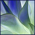
the shift from yellow to blue is lovely and the lines are gorgeous. I suppose nature gets some credit for that! :) But you cropped it well, to put the emphasis on the lines as an abstract design. I have a feeling this is better than the original. This one's more like an abstract painting.
This is a fantastic shot and I would have scored it high in the challenge. The purple is great and overpowers the green a bit, but it works well. It would be interesting to see with a bit more color.
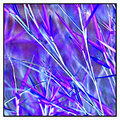
I absolutely love this, and it's funny, if I hadn't seen the original I almost wouldn't know this was inverted. Maybe a "little" more color, because that purple is such a great color. The only other suggestion I would have is to somehow (have not idea how) reduce the brightness/whiteness of the lower right corner, between the stalks.
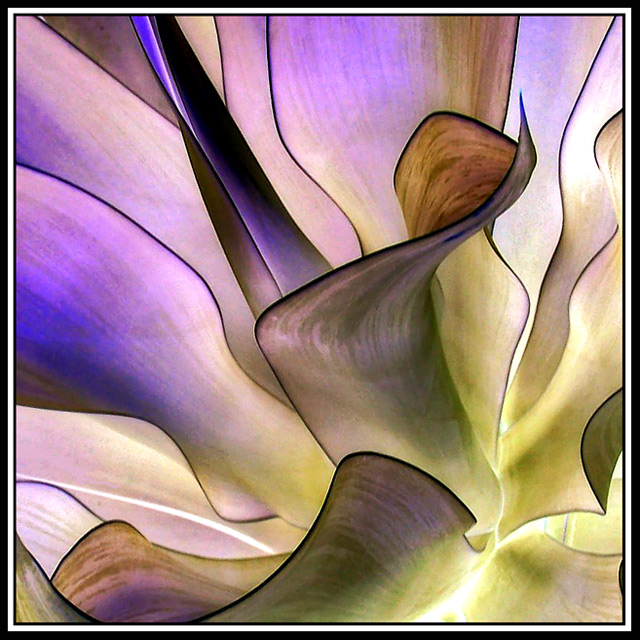
Glad you didnt enter this one in negative challenge. Would have knocked me down another spot. Again - great lines and curves. The negative effect works really well on the outline of the leaves. I may have tweaked the saturation just a bit more for a little more color. You have your self a great model there.
This is beautiful, negative or not. I think it would have done well in the challenge. I love the colors and the curves. You have really got a way of photographing these plants.





 Add photograph to your favorites
 Add photographer to your favorites

 Photographer found comment helpful.


