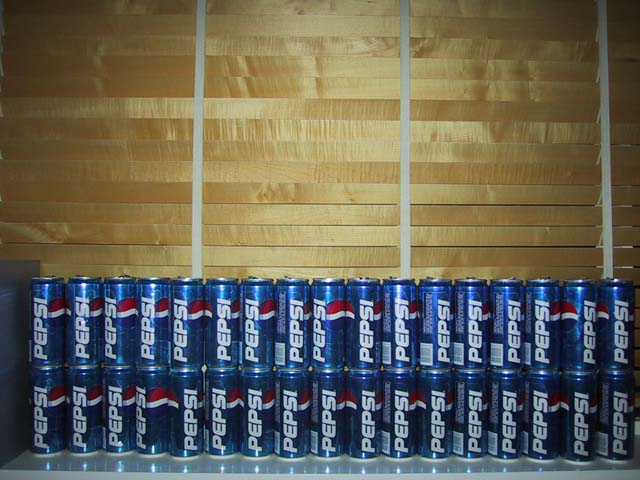
OK, someone like Pepsi WAY too much. But beyond that, I find myself simply just thinking, "Ummmm, ok." Trying to figure out what this shot is supposed to convey and I'm just not getting it. About the only suggestion I can make is that you stack enough of the cans so that you could shoot an entire "wall" of them instead of just two rows -- the table and windowblind aren't doing anything for your presentation.
I like the concept of the photo, the color and symmetry of the cans, and the reflection in front. I think that the background weakens the shot though and should have been a solid white or high contrast color. I think also to crop the front so the table edge doesn't show or better yet, to have more front surface to reflect the full image of the cans.
you were obviously trying to create a repeating pattern here, and the idea is good, however, i would've cropped the shot so that the cans at either side are partially cropped off, implying a continuation, and i would've also turned the labels to face all the same way. not sure how i would've used the space above the cans, i think it's too much and detracts from the repeating pattern aspect. just my thoughs. -- gr8photos (4)
addition: just occured to me, it would've been fun to fill the frame with the cans and place one different can (coke?) in there somewhere just to create a break in the pattern.
It's tilted to the right. Object on the left is ditracting. Good choice of blue-yellow contrast, but use of flash is bad choice. Also, geting closer and capturing only details could work much better. Good effort.
Need to have better lighting for this shot. Also could of been cooler if the wall was not as wide and another level higher or the cans completely filling the frame.
This didn't inspire me much either way... Technically, I think a closer crop that excluded the space on the right and left of the cans. The blinds are kind of interesting, but there's too much of it for my taste.
Would it have been possible to get a different "stack" instead of just two rows. Maybe a pyramid or something. The open wall/blinds makes it seem like it needs something. Or fill the frame up with Pepsi, even if you couldn't include all of the cans.
hmm, just a little bit. They're coming out with a Berry Pepsi next month - just thought i'd share that info - I enjoy pepsi this much as well ;) it's too bad they didn't fill the shot tho.
Perhaps if you had come in closer, to get rid of left side thing, would have made the logo that much clearer, and would have gotten rid of more of whatever the cans are sitting on, turned up the lighting, and made sure all the cans were facing in more of a patternistic way - just my thoughts. Of course it may be my biased opinion, I'm a Coke drinker ;P Good job. ~ cthenk
Looks like the beginning of a large collection ;-) But not a picture I am going to frame and hang on the wall. What light source are you using, it's way hot in the center and drops off fast toward the edges of the image.
I'm not sure what the intention is on this photo.. I would like to have seen more visual and artistic impact for the free study challenge... = 4 - jmsetzler
Not a bad subject, but the angle isn't very interesting. Try this shot again using a more dramatic angle, and you'll have a better picture. A extreme perspective shot with the cans going off into the distance, for example.






 Add photograph to your favorites
 Add photographer to your favorites


