| Author | Thread |
|
|
05/15/2006 10:23:44 AM |
|
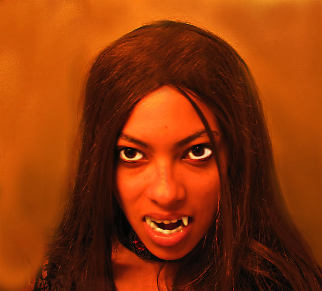
well i got DQ'ed for improving my background. I didnt think it would be a problem, but I was wrong. My score was a 5.1, which was pretty generous considering the photo was so out of focus. |
|
Comments Made During the Challenge  |
|
|
05/11/2006 10:26:08 PM |
Poster shaped crop would make this better...
TC |
|
 Photographer found comment helpful. Photographer found comment helpful. |
|
|
05/11/2006 03:53:17 PM |
|
Very eeerie shot, i think I'd like this film. |
|
| Photographer found comment helpful. |
|
|
05/10/2006 03:37:15 PM |
|
More like a painting than a photograph, eye-whites are very unrealistic. |
|
| Photographer found comment helpful. |
|
|
05/09/2006 05:29:21 PM |
|
The image works as an ad for a movie for me but to be honest, I've never seen a square poster. With the right crop, this would have really stood out... :) |
|
| Photographer found comment helpful. |
|
|
05/09/2006 04:04:32 PM |
|
| Photographer found comment helpful. |
|
|
05/09/2006 03:35:27 PM |
|
a blaxploitation horror movie from the 70s! I am so there. I would suggest cropping the right and putting text on the left. Good picture, and great work from your model. What fabulous eyes she has! (the better to eat you with) |
|
| Photographer found comment helpful. |
|
|
05/09/2006 06:24:58 AM |
|
Like the idea a lot, but I feel that you blurred or used NI too much, sorry. |
|
| Photographer found comment helpful. |
|
|
05/09/2006 02:11:55 AM |
|
Shot is great and the mouth, lips & teeth are very well done, great emphasis, eyes I'm afraid let it down for me. Well done though |
|
| Photographer found comment helpful. |
|
|
05/09/2006 01:42:21 AM |
|
| Photographer found comment helpful. |
|
|
05/08/2006 12:56:24 PM |
|
This would have been so much better without the heavy noise reduction. the colors give a creepy feel to this, which you obviously intended. Background's fine. Very white eyes contribute too. But noise reduction artifacts bother me. |
|
| Photographer found comment helpful. |
|
|
05/08/2006 02:31:41 AM |
|
great title and finally a good refresing idea. |
|
| Photographer found comment helpful. |
|
|
05/08/2006 01:55:13 AM |
|
the image seems to have too much blur or neat image applied. Not crazy about the lack of sharp focus or details in the skin. |
|
| Photographer found comment helpful. |
Theme:
Classic /
Light /
Dark
Home -
Challenges -
Community -
League -
Photos -
Cameras -
Lenses -
Learn -
Help -
Terms of Use -
Privacy -
Top ^
DPChallenge, and website content and design, Copyright © 2001-2026 Challenging Technologies, LLC.
All digital photo copyrights belong to the photographers and may not be used without permission.
Current Server Time: 10/18/2026 03:04:23 AM EDT.







 Add photograph to your favorites
 Add photographer to your favorites


