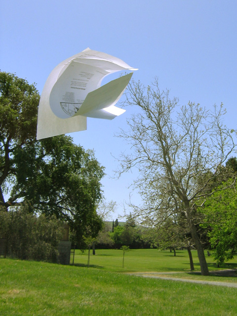
This was one of the few images to really meet the spirit of this challenge. It is clearly well thought out and shows a creative mind. The use of printed papers adds enormously to the effect and interest. The sheets have made appealing curves and shapes and have seperated well.
The trees help suggest the idea of wind, but had the sheets been solely against the blue sky, instead of against the trees, I think you would have scored even higher. But compositionally it does adhere to the rule of thirds well.
I like the idea. The background is distracting. Also, I wonder if some more separation between the sheets would have been more dramatic (but maybe impossible to catch). I like the inclusion of writing on the sheets of paper because it quickly identifies them as sheets of paper.





 Add photograph to your favorites
 Add photographer to your favorites

 Photographer found comment helpful.


