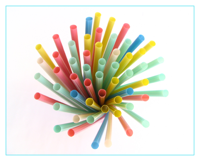
There is something about coloured straws that evokes a pavlovian response in adults: they instantly bring memories of childhood, and the feelings that go with that, to mind. These feelings are, 9 times out of 10, pleasurable. Pastel colours, too, often have the same effect, because as babies they are what our rooms, furniture, clothes...etc are decorated with.
Compostionally this is appealing as there is a suggestion of a spiral, both in the overall arrangement and the way you arranged the colours, particularly the red ones (well done!) The balance between postive and negative space is also good.
The focus does seem a little on the soft side, but this adds to the calm, comforting feeling the image promotes.
The background seems white enough on my screen, and whilst the border initially bothered me, the more I looked at the image, the more it seemed right. It balances the red and echos the green and blue straws.
very creative composition with an interesting DOF. nice lighting but I may have arranged the straws so that the darker ones were closer to the light source because the lighter ones don't seem stay as sharp against the white background.
I really like your composition with the staggering heights. It works well. The background has a pink tint to it on my monitor. To get the even white throughout you would have needed more light on your background as it should have a hotter light than your subject. I also think it would have helped portray more rhythm if you would have grouped your colors. Like white in center, then blue, etc. Just my opinion, it looks fine the way it is.
I couldn't see any order to the placement of the colors. I think the landscape orientation and border take away from the picture. I do like how clean it is. It looks like the straws extend down into nothing at all.
Seen soooo many straw shots that I got burned out on them, however, the softness of this one and the "perfect" border color selection makes me want to frame it and pput it in my kitchen. Well done.






 Add photograph to your favorites
 Add photographer to your favorites

 Photographer found comment helpful.


