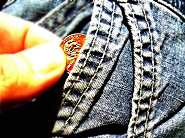
Color adjustment on image was too far in the yellow zone. Contrast on jeans is really good though. Your penny seems a bit too sharp, though. You might have oversharpend to make the jeans really show texture, but at the expense of the penny, as well as too much contrast which shows up in the fingers.
I really like this image, The conflicting angles work extremely well. The only problem I see is the loss of focus inthe upper right and the fingers, as well as the fingers seem to get washed out in the upper areas.
you might have been going for this particular style of pp - if so, please ignore my comments... for my tastes, the fingers are a bit blown - great idea and certainly meets the challenge.







 Add photograph to your favorites
 Add photographer to your favorites


