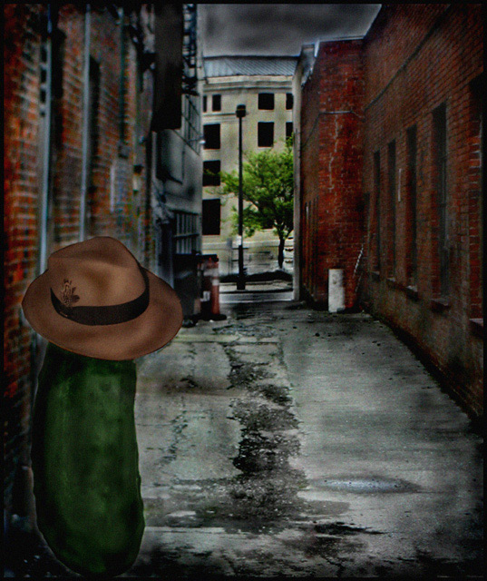
This will probably get dinged real bad for overprocessing. But I was shooting for a 50's style detective thriller type feel - in a dark back alley. I have no clue what made me think of the title, but I thought it was funny and decided to run with it.
The alley is the first shot taken in downtown Columbus. I edited out a car and did some minor tweaks to it. I then set it as my desktop. I printed out a fedora, cut and taped it to the pickle (yes that is a real life pickle) and posed it on the screen. Took the picture and then began several hours of processing. Lots of burning, very little cloning, a little doging, levels on different parts of the pic. Layered out the hat, the pickle and the background to get different levels of shadows and color. Added noise, selective saturation and desaturation and more burning (alot more). I so wish we could have used text. I think that would have really made this look like a 50s/60s movie poster. I had fun with this and I have no clue how it will be recieved. Fingers crossed.
Statistics
Place: 97 out of 207 Avg (all users): 5.5759 Avg (commenters): 6.0769 Avg (participants): 5.3474 Avg (non-participants): 5.8021 Views since voting: 1652 Views during voting: 359 Votes: 191 Comments: 27 Favorites: 1 (view)
I love the creativity of this one. The juxtaposition of all the elements (pickle, hat, street b/g) is priceless, if a little wacky.
While I like the grunge look, it seems a little too dark where the pickle is concerned - could do with slightly different lighting to make it stand out more (although obviously it still needs to fit with the b/g)
I like this image, looks like a 1950's drawing.
the only thing that I don't like is the bright spot on the roof and the water on the ground, those bright spots are bad for the image.
I liked the idea and the title, but the postprocessing looked too heavy for my taste...just too dark. Nice hat though. I know this critique is not too helpful.
I think this is just one of those ideas you just have to try because you want to. I know I've wandered down that path before myself. Come to think of it, I charged down that path in this same challenge. I had a nice hat too. ;-)
thought this one was nice. good idea and well played. looks like a poster.
my only problem with it is that it looks like you processed it (yeah i know you did). but it actually looks like it. other than that it is a great image.
This was certainly a very unique take on the challenge and I'm surprised it didn't score higher. You are always so creative with your entries! The editing is terrific - great job.
Trading post...
This is quite the bizarre shot. I like it. The only thing is it looks more like a painting than a picture. There's something else about it that seems off, but I really can't put my finger on it. Maybe it's the perspective on the pickle. Not much help, I know. Sorry.
This is too funny. I JUST finished the trading post comment, then I pulled you again from the CC cue. How the heck does that happen?!?! In addition to what I just added, I think that the burning is a little overdone. It adds a great dirty feel to the alley, but you can really see it in the sky. Going for the 50s-60s poster, maybe desaturating is all a bit or toning it differently would have given an even older feel. Very creative, but just not my preference.
--Trading Post--
I really like the alley shot, but the pickle looks too much like it was added as a composite. While naturally out of place, it really stands out here. Again, great creativity. I have no idea what could have drawn a higher score.
Too funny! I meant to go back and add a comment that this was my alternative title - I kid you not. Though I had no idea what I was going to shoot if I had to shoot it. I liked the post processing, by the way.






 Add photograph to your favorites
 Add photographer to your favorites

 Photographer found comment helpful.


