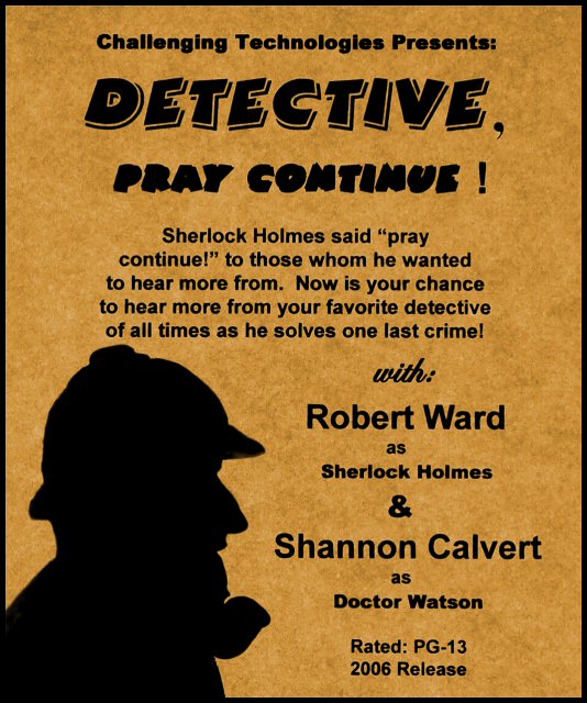
What I did here was typed up the actual wording and printed it out on regular 8 x 10 printing paper. Nothing fancy, as you can see the texture. I taped this to my window. This was now my backdrop for the little statue my husband owns of Sherlock Holmes, which I held up to the paper and took the shot. I had a lot of trouble with proper lighting without shadows appearing from the statue, so this method of having the outdoor lighting in the back of the paper seemed to get rid of that and gave me the silhouette I wanted.
Sorry to Bear_Music and Scalvert. LOL...Bear, I chose you to play Sherlock because you seem to be always solving problems on DPC for others by way of technical or general information. Scalvert, the only reason I chose you is because I look at Watson (not that I know much about him) as someone who "helps" solve a mystery, and you do that when you help us know the "how to's" behind some of your very creative photos. Hopefully neither of you were offended as being mentioned in this somewhat corny rendition of a movie poster. :)
The tones, I chose them because to me it gave it an old-world type feel, just as I have seen in other posters with the Sherlock theme.
The saying "Pray Continue!" really is a saying that Sherlock was quoted often as saying in Doyle's books. He would say this to others during conversations he found interesting and on subjects he wanted to know more about. My husband, being the big fan of Sherlock that he is, helped me with this title that was more akin to Sherlock and would make sense as a movie title. I hope it did that.
My first title and entry was "Detective's Prestige Continues", and was to be a solid black on stalk white photo with Sherlock's silhouette profile only, in black, and encompassing the entire left of the photo. I really liked it. It really grabbed your attention, but I felt that some would think it too much dead space for a movie poster. Therefore I took this path.
I hope you got a chuckle out of it anyway! I do have a feeling some will think this a DNMC due to the writing, and the scores may reflect that. However, the writing wasn't written in PP. Hopefully it will ask to be validated early on to end that "mystery" if this does occur. LOL....
My best to the winners!
Rose
Statistics
Place: 173 out of 207 Avg (all users): 4.9180 Avg (commenters): 6.2667 Avg (participants): 4.5488 Avg (non-participants): 5.2178 Views since voting: 1138 Views during voting: 378 Votes: 183 Comments: 19 Favorites: 0
I wanted to make comment after challenge, and here it is.
SO MANY people were complaining about not being able to add text for their posters and how they were getting hammered for it. Yet, those like mine got hammered for the opposite.
It really amazes me how many didn't think of the SO simple methods for adding text. Paper, monitors, light painting. The problem is, most people "wanted" to do a whole and real poster than just a photo "for" a poster, and then it seemed that some voted this down because it did have text and as one person put it, was "a real movie poster". How utterly ironic that is.
You look at this entry and you see a movie poster. It went above and beyond what this challenge called for. So what happens? It gets voted down for it? I think that is just "wrong".
Ok, rant over on that end. ON THE OTHER HAND, no it isn't some great landscape or castle on a hill, or one of my favorite other shots like the bone in the fishes mouth shot. It is just a silhouette and profile with movie poster wording and an old world feel to it and a title that made sense. It IS what a real movie poster would look like, AND a debut one. BUT I can understand how some felt they didn't know what to do as to scoring it based on the following: They were torn between voting it up as a poster, or voting down because they didn't know how it was achieved and/or that it wasn't some great photo as they may have expected to see.
The scores on this suffered for what I feel was not voting on your first instincts of this shot popping up on your screen and because I feel voters were just getting too deep into thought on the woulda, coulda, shouldas of what this was "supposed to be" according to them.
To me, (and not to be arrogant, and I'm not even angry that once again I stumped most voters into confusion but take that as a compliment), this entry was the closest thing to what this challenge was to represent. I was a manager for Showcase Cinemas and several others for over 8 years. I knew exactly what I was doing for this challenge and how to best represent my entry, and how to do it to stay within the ruleset. However, when I first thumbnailed through all of the entries and didn't see anything even remotely close to this entry, I was truly shocked. I was like "WHERE are the great designers and creative photo enthusiasts with their best poster feels"? I didn't see more than two or so other photos with wording on them, but just photos, photos, photos; and most with titles that didn't even make sense. Another thing I saw was just a title to fit a photo, but not a title that would make "movie" sense for a story.
When I read the challenge description, in my mind it meant to come as close as possible to what a debut poster would look like using a photo and your skills in creativity to do so, and although it said take a photo FOR your debut poster, to me adding text to the profile silhouette was only an added bonus as in making the actual debut poster itself. Some read it differently, and took photos that left blank spaces for imaginary text. (WHY have it be imaginary when you can add it? In this entry, there was no imagination to be had. The text of the poster was actually there to read, including a synopsis, the rating, the release date, and even the stars of the roles to be played??) Not adding text was ok too, BUT, then there were complaints in forum about how if they could have added text, it would have made their shots better. To contridict that, when text WAS added, as with mine, the rant was then about how it wasn't supposed to be an actual poster. LMAO....I find the thought process here truly amazing at times.
All in all I feel most did the job well for this challenge in how they read the description, and I am certainly not going to say I didn't. I still think this was one of the best representations of it. The problem I see with my entry is really that it was too much poster and not enough photo, and as one person stated "more of a graphic design piece", which I also take as a compliment. However, it was validated under basic editing rules, and now that others know the simple method of how to add text when they want to, I feel at least compensated in that manner if they use my photo for their further learning of the process.
To be honest, after a while I just stopped hitting the update button on this enty. I just tore into the next challenge. It's another creative entry that is also already getting more mixed reviews. Some that are praising it highly, and some that are just determined to find something opposing with the shot no matter the concept or composition. LOL...And that is what makes the challenges fun :)
All I have to say to THIS is the profile is ALL wrong for me, LOL. I ain't got nothing like that nose... I sure as heck hope this was accomplished legally so we can see how it goes :-)
An Original real movie poster! Can't wait to see how you did it. Is there a clue in the poster as to who did this? I see i. Nice even lighting and great comp.10
This looks like a literal representation of exisiting artwork, but it says it has been validated, so what do I know? I'll be waiting to see how you did this. However, it doesn't look much like a photo, it looks like digital art. Probably too much large text for an actual movie poster.
Good concept and decent quality photo. Unless the shadow is projected onto the poster backdrop this entry will probably be disqualifed. But it look great to me! 7
I expect this will get DQ'd for violating the Artwork rules. You may want to go back and review the rules yourself. Meanwhile I will vote on it is if it were legal - good luck.




 Add photograph to your favorites
 Add photographer to your favorites


 Photographer found comment helpful.


