From the CTP MkII
Disclaimer: The following crits are personal opinions, not photographic dogmas. Please see them as suggestions, not claims of mastery nor a show of hauteur.;p
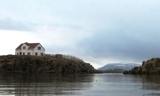
First Impression: Dang, this is nice. 6 because the colors're flat and a bit washed out BUT given the right PP, it could hold its ground up there with the big guys.
Composition: 8 here. Because it WORKS. And I know YOU know why it works so no more from me on this regard.
Subject: 6. Not really a fan of this genre, but I think you did good with it.
Technical: 5. Colors are bland and exposure's a bit under. But really, it's nothing a little PP couldn't fix.
Improvement: Nothing (from me) with regards to the shot, a wee bit of dodging and burning and bumping up contrast and saturating AAAND some sharpening for PP.
Summary: It's a good shot, really, with the potential of being a great shot. With proper PP, that is. Aaaaand I'm a number too short on screws in the head so please do not be offended.;p
Classic example of great subject, effective composition (except move to get the car out) but the flat light makes for a very tough image to catch. No dramatic color to compensate.
I think since it doesn't really have bright vibrant colors maybe what you should have done is waited for a sunnier day, or changed it to B&W or sepia toned...I think you have a great shot...just a little more contrast imo! 5
Nice composition here, but the sky needs some work. You positioning for the shot is very appealing and the focus is crisp. Perhaps an CP or graduated ND filter would have helped with keeping the sky properly exposed. I do like the crop, andit looks like a place I'd like to live.
Composition is good with a nice straight horizon line properly placed. With regard to exposure, the tone is a bit flat and portions of the sky are completely blown out. This image also looks a bit OOF. A strong idea; overall, a decent shot.
I love your composition and the way the image is set up. I just wish the sky was more interesting and the lighting was more dramatic or warm or something, like sunrise or sunset. The whole image would be transformed by warm sunrise light raking across the textures of the scene.
Very pretty seen but it seems rather dull and washed out. Maybe with advanced editing, with dodge, burn, saturation and some level adjustments, you could really give this image the pow it deserves. The clarity is there. The composition is there. Just needs some post editing to really make it shine.







 Add photograph to your favorites
 Add photographer to your favorites


 Photographer found comment helpful.


