~trading post~ Good lighting, but in the end its just 'a picture of a toy' to me (sorry!)
I find it hard to know what to suggest, because you've got the technicalities right, good focus, expoosure, clean backdrop... but it doesn't really 'say' anything.
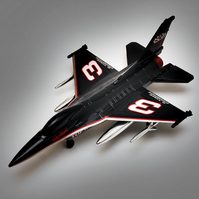
Overall, a very attractive image with excellent lighting, though the subject would not have suffered from being even more lit. Technically, this is a good photo, with nice composition and interesting highlights. I think though that it is banal; technically good photos must also have an interesting and engaging subject (and I know this because I'm the king of technically acceptable and otherwise meaningless photographs). I really would have liked this to have done better, though, because I think it really deserves it.
Trading Post comment
While it's only an "average" subject, the lighting here is great! You've done an excellent job lighting the subject, maintaining excellent detail which is even more impressive given the object is black and chrome, and even creating a "texture" to the light beneath the subject. I suspect the not-so-great score is based on limited appeal of the subject matter. What you've done with the lighting, though, can be transferred to lots of other shots, and that's a very good thing!
even though this image is ok it makes a really bad choice for free study, this is the challenge where people are voted down for lack of creativity, and this image lacks all creativity, like a catalog picture.
and the dark edges probably from the high pass filter makes it even worse..
airplanes can be good subjects, but they look better from below or from same level, they usually look uninteresting from above, just like your image.
I'm not trying to be judgemental, but this image would have scored much higher in B/W challenge.
Trading post...
Reminds me of a catalog photo. This wouldn't hold my interest much except as an advertisment for a collectable. My husband's a big Nascar fan, me not so much. Technically for this type of image I don't think you're supposed to have shadows. The crop works well. Overall, a good commercial image.
Trading post -
I was one of the masses that gave this a 5. This is a tough one to critique (or maybe easy). The technical aspects of the shot seem to be fine. Good focus. The lighting is nice and the shadows underneath soft. But it doesnt really hold much interest to me. Straightforward shot of a model plane. I probably didn't spend much time looking at it while voting because it didn't have anything that screamed out at me "Look at me". The 1s,2s and 3s are a bit harsh I think because of the technical aspects being there, but the shot didn't leave me with any feeling or emotion. Just the fact that I looked at a model plane.
Nice clean shot with an effective use of white space around the plane with gradual graying as you move away from the plane. There is a minor bit of room reflection around the fusilage, but I can't tell whether it is the camera or something else in the room. Getting rid of all traces of room reflection is a bear of a problem...but worth trying hard for the sake of the image. I don't get the title...perhaps I am just dense.
Generally, this is a good clean shot.
--Trading Post Comment--
I got to you before the voting was over! I still like it, and think that it is a nice shot. Maybe a hair over processed, but not terrible at thus resolution. Nice lighting, and I think that the square crop serves this one well.
I though her was a NASCAR dirver. Very neat capture. The lighting and the exposure are near flawless. I am not normalyl a big fan of product photography, but this one works well. Too bad little E blew his engine MOnday, huh? NIce work.
I don't see a connection; one would never equate a stock car to a jet, but it's a pretty good image. I can see banding artifacts in the background, which makes the image look too processed. The way to avoid it is to minimize levels/curves adjustments, which tend to emphasize these bands, especially in grays & blues.






 Add photograph to your favorites
 Add photographer to your favorites

 Photographer found comment helpful.


