Greetings from the Critique Club.
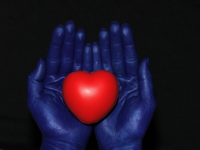
My first thought is that despite the heart is suppose to be warm, it is a cold material. Plastic does not strike me as something that conveys a feeling of warmth. Conversely, the hards which are suppose to be cool, despite the blue tone, do not feel cold to me.
The compostion is a little bit central I wonder if there would be a way to compose it that would make the image a little bit more dynamic? Just my thoughts, I hope they help.
What I do think works really well is the black background and the it really makes the colors jump out at you. It also really helps the viewer to focus their attn. on the image you are presenting with no distractions.
Congrats on your good finish!
Wanted to see if anyone got the reference in my comment... it's a quote from a series called Firefly which was sadly pulled by Fox. The baddies wear blue gloves and go around menacingly in pairs.
I like what you were going for in this shot... I think the hands would look 'colder' if they were not quite as warm a color... good choice of the bg and the lighting is very well done.
Nice idea. Watch out for those reflective ridges. I lost some points on my Yellow III entry because of light on the ridges. Doesn't bother me personally so much though.






 Add photograph to your favorites
 Add photographer to your favorites


 Photographer found comment helpful.


