I'm sorry, but without any input from you in technical details or comments, it's just not possible to critique this image.
When we do a critique, we go past just the photographic result, that's what voters comments do. The critique looks at what you were trying to achieve, how you wanted it to look and what issues you had in getting the image captured and ready for voting.
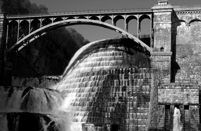
Very nice job, probably would ribbon in a bridge contest. I love the detail. B&W adds to the icture. I only wish that the light would have hit a littel more of the water on the left, but that is not your fault. Good luck -9-
I like the black and white processing here - good strong contrast which works well. The subject itself is certainly also interesting - I've never seen it and yet am intrigued by what is clearly an old and ambitious bit of engineering. The composition doesn't really work well for me. The angle of the near horizontal line of the bridge near the top of the frame make it feel off-kilter to me and somewhat top heavy. The area in the lower left feels dark and "muddy" in terms of lack of detail. I like it because I find it interesting but I don't think the image works in terms of composition/ aesthetic punch.
The architecture here looks amazing but it looks as though too much is crammed into this little photo. It might have worked better for me if you focused on one element.






 Add photograph to your favorites
 Add photographer to your favorites

 Photographer found comment helpful.


