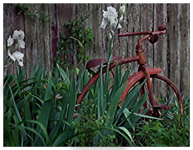
Nice crop and composition. I love shots of old rusty stuff! IMO getting rid of the tall flowers in front of the tricycle would have been nice. Then I think a shot like this calls for fairly heavy handed processing to make the light contrast and colors(especially on the tricycle) really pop. Just my opinion though - some don't like heavy processing - sometimes I do (and voters seem to be fairly forgiving about it in Free Study challenges).
I think you have an interesting main subject. The tricycle has some good character to it. Unfortunately it seems lost among the irises. I think that a closer cro on the left to get rid of the flowers would have helped bring the focus to the trike. Maybe even a higher angle for the shot instead of looking straight on would have helped as well. I want to see the trike more so than the flowers or the greenery.
From a focus/sharpness point of view there seems to be something funky going on. The picture overall has an odd texture to it (if that makes any sense). Even the blurred background feels off but I dont know why. A slight bump up in saturation, especially on the trike would have been nice I think. Even a bit more on the green as most of the colors seem a bit flat. More light may have taken care of this as well.
THere are alot of different textures, lines and shapes going on. I think the composition is just a bit too busy. Isolating the trike more would have given you a higher score I believe.
You have some nice work in your portfolio and I look froward to seein gmore of your entries inthe future.
Image seems very digitized. Not sure if it is because subject was far away and you tried to crop, but details are very dotted. I used an Olympus D550z last year, and for some reason something happened in the file sizes and most of my images started coming out this way. Luckily I was able to get a different camera. Nothing can be done about the problem, though often the prints come out just fine.







 Add photograph to your favorites
 Add photographer to your favorites


 Photographer found comment helpful.


