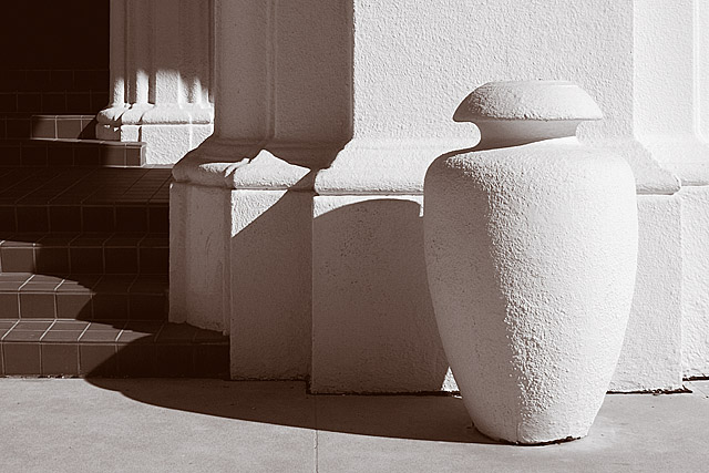
Front of a building on Randolph Air Force Base. Post processing includes curves, convert to black and white via channel mixer, duotone, some minor cloning, USM and resize.
Statistics
Place: 61 out of 211 Avg (all users): 5.9312 Avg (commenters): 7.1111 Avg (participants): 5.7453 Avg (non-participants): 6.1687 Views since voting: 921 Views during voting: 248 Votes: 189 Comments: 30 Favorites: 2 (view)
since this is free study you can enter anything, I was amazed at how high this image scored as the subject isn't that interesting.
I think the title helped alot in geting that score, just to let people know you were photographing lights and shadows and not some vase was smart.
to get on the level where you start looking at light and shadow without looking at the subject is a big step in photography and art study, it shows that you are getting in touch with your artistic side and that's a good thing.
one of my favs. absolutely loved it. i liked the exposure (which had to be spot on in this one) and the position of everything including the sun and shadow. in my opinion you got totally robbed from not getting a ribbon. but that is just my opinion.
Shame about the date, I also preferred the original, with much more soft, sensitive light. Nevertheless, this is a beautiful study and well-deserving of the score
Composition is strong, following the rule of thirds. Although I think I personally preferred the slightly wider view of the other version - seems to make it slightly less cluttered.
The lighting is what makes this shot - it shows off the texture of the wall and post.
I like the juxtaposition of the sharp lines and curves; especially with the additional element of the interplay of the shadows.
I'm not convinced by the toning, although I think thats partly just me - I always prefer a cooler tone on duotones. But I liked the treatment of the other version better
Lovely, lovely image, with soft shadows and interesting shapes that really stand out for me. I love the contrasts in the textures between the vase-shape and column, steps, and sidewalk (?). Colours are gentle, muted, and beautiful. Everything is set off so well, and I really start to get curious about where the steps are leading, and where this is. Composition really satisfies. Beautiful, congratulations.
Nice shot overall. Good lines, curves, shadows and focus. Interest level for me was a bit lower. Even though from a technical standpoint (as far as I am able to judge technical aspects of pictures) this works well, the image itself doesn't scream "Look at me!!!".
Edit - Looking back at your top challenge entries I am really glad that this didnt do a tad bit better. I think your teapot shot is far superior and wouldnt like to see that one replaced with this one.
Trading post...
I liked this. It's an appealing visual. The shadow play is very nice and consistent. The texture of the post and wall show through very nicely as well. It's the type picture I see hanging in office buildings everywhere. Maybe you should market it!
I like the geometric shapes, the pattern of shadows, and the duotone. Good focus too. Detail in the shadows is good too. Frankly, I don't know what you might do to improve on this, except to try and reduce the blown out light area on the right side of the vase/vessel. I would have scored this a 6 or 7.
--Trading Post Comment--
Nice capture and nice score. I think that you scored about as high as you could have with this shot and this site. Vivid colors and overdone neat image seem to do better than nice composition and striking contrast. I really like the tonal range that you captured here, as well as the contrast. Beautifly composition and crystal clear focus also work to make this a nice image. The dark and bright areas of the capture also serve to make this a well-balanced image.
I really love light, shadow and shape pictures like this. They have a changing and challenging way of being attractive. I am usually one of those who suggests people don't use gratuitous B&W but in this case I think it might have helped the image. The brown of the steps seems out of place and so a monochrome treatment might jus tie all the elements together
This is an enjoyable image, and I really like the concept that is being envisioned here. Potential here is very high. What pulls it down for me is the stairs to the left. Try cropping this by bringing the bottom up to remove the seam where the column meets the sidewalk and trim off the left side to remove the stairs. How is it? Probably would need to reshoot and position yourself a little differently to compose it more to the right. JMO. Good luck in the challenge.








 Add photograph to your favorites
 Add photographer to your favorites

 Photographer found comment helpful.


