I have studied your iamge and have the following to offer:
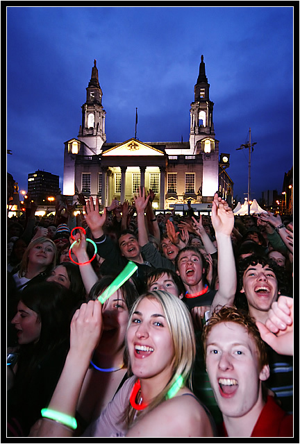
Composition/perspective: the balance in this shot is perfect. On one hand you are drawn right into the crowd and their enthusiasm. On the other hand you are drawn to the building in the background which gives it its political sense. Well thought out, even though it appears a spontaneous shot, and that is exactly what gives the image its strength. Your message, via title, is expressed perfectly and captures you instantly. Your angle of approach to the shot lends a real interesting element of apparent movement without motion blur that works well.
Color: well preserved colors throughout. The bright colors in the bio tubes in the foreground, that are so well captured, compared to the muted night colors of the background is very well done. Both retain their strength and present the local subjects perfectly.
Lighting: top half: very well controlled exposure to preserve and not distort the detail and gradations. Bottom half: extremely well controlled exposure for the foreground. The difficulty in balancing a dark background and a bright foreground (flash?) is so well done that both the top and bottom work not only together, but probably separaely as well.
Challenge requirements: very well met. Your message and intent is clear and well executed. I could picture this on a cover - rag or mag - very easily.
Overall/my opinion: at first glance you are drawn to the foreground, eliminating the background. But in the context of photojournalism, you are forced to look at the whole image and take in the combination of scene and headline. This image takes you to the exact point you should be at when viewing such a photo - the mood at the time - both sides. Very well done composition and and extremely well done image!
I don't know how you did this. It is a very nice ¿photo? It appears to me there is only one live person here and the rest of the shot is a printed background. The depth is quite nice. It'll be interesting to see how you did this and to see if it passes the rules test. Giving it a 10 but I think major elements are artwork.
great shot. definitely captured a moment. excellent composition. really, really bad border. seriously, have you ever seen a border like that in the newspaper? hopefully for you, the voters will see past that...
I don't know how you did this. It is a very nice ¿photo? It appears to me there is only one live person here and the rest of the shot is a printed background. The depth is quite nice. It'll be interesting to see how you did this and to see if it passes the rules test. Giving it a 10 but I think major elements are artwork.
Faboulous lighting! Odd that the faces in front seem to be "squat in", almost like you changed the perspective of the image in photoshop. Perhaps it is just the way the lens took the picture.





 Add photograph to your favorites
 Add photographer to your favorites

 Photographer found comment helpful.


