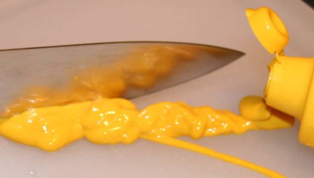
A nice idea and a good composition but not quite well executed. The little band of black up in the corner is distracting. I like the reflection on the knife.
Good idea, but more care could have been taken with the execution. Attention to detail is critical, especially in basic editing where you can't fix things in post-processing; things such as composing to avoid the little dark corner. I do like the lack of shadows, though.
Love the handling of the challenge. You don't even need to see the title to immediately know what the pic represents. Good composition really makes this pic pop
Not quite as in focus as it could be, which will really impact your score here. Top right corner distracts a bit, too. Nice try though, and a great concept for the cliche challenge.






 Add photograph to your favorites
 Add photographer to your favorites


 Photographer found comment helpful.


