I have studied your image and have the following to offer:
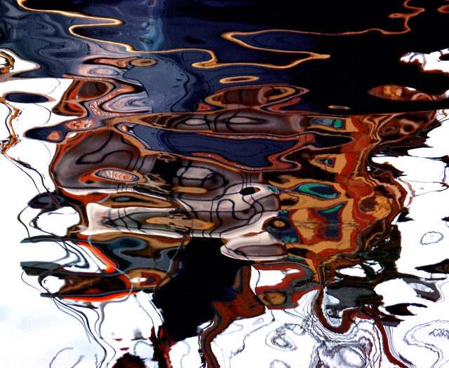
Composition/perspective: this is an interesting image for many reasons. Being totally abstract in composition, there is no point of reference for comparison. But that doesn't hurt the image. I think it is one of the stronger points. The reflection is very well placed in the photo and as such makes you look all the longer trying to figure out what the reflection is of. By the time you figure it out you are so caught up in the colors (see below) and the soft designs that you are absorbed. Very pleasing shapes and designs and your angle of approach helps to strengthen that aspect. Very well done!
Color: very well developed and preserved colors in the image. The contrasts are strong and not distracting. The balance between light and dark colors is very well done. The range of colors is great and one can find pleasing tones all across the image.
Lighting: nice control of natural light - good choice of time of day as well as exposure control. Nothing seems blown out and nothing seems too dark. All delineations are clear and crisp.
Challenge requirements: as a Free Study the boundaries were off. A brave choice to enter such an abstract image. But it fits the challenge well as it allowed you to obviously express an artistic side while not relying on processing to achieve it. Very creative image.
Overall/my opinion: very strong abstract image. A real nice overall balance and composition. I like abstracts to begin with and this I find very pleasing and interesting to look at. Even for an extended period of time. At first I was a little distracted by some of the tendrils of reflection leaving the image at the bottom, but when viewed critically, they really don't have an impact at all. Very well done image!
Personal best congratulations to you, Guðrún!! This has gorgeous colors and designs. Many good entries in this challenge, and you are right up there with the best - you go, girl!
Interesting abstract! I like the strong colors in the water...almost like an oil slick. Think perhaps the neon orange (on the left) might be a bi heavy on the saturation...it's feels like it draws undue attention.
Well now, this is interesting. The swirling lines and colors make a wonderful out-of-the-box abstract. I wonder if it would have been even better with the white'ish areas replaced with the reflection of a deep blue sky.
Anyway, congrats on a nice image! High marks from me.






 Add photograph to your favorites
 Add photographer to your favorites

 Photographer found comment helpful.


