Okay, I'll be trying a different crit format for this particular entry. To keep it short and sweet.
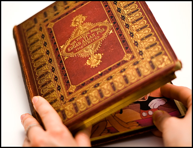
What Works: The lighting's great, the exposure's great, the subject's funny. This particular mix got it placed where it is right now.
What Needs Improvement: The shallow DOF. And the page misalignment. But I guess you know of these by now. These prevented you from placing higher, IMO.
Summary: Minus minor nitpicks, it IS a great entry for the challenge. Congrats on your current PB.
First Impression Very Nice shot, with WOW factor.
Composition: Very nice composition with tight corp.
Subject: I really like the subject. Nice take on the challenge.
Technical (Colour and light):
The color and lighting is perfect.
Improvement: Only one thing I don't like here - the blur effect is the front. It's definately very good DOF, but just wonderning how it would look with focus is front too.
Summary: Very nice picture, creative, funny, perfect for the challenge.
Very nice image. Congrates on your 12th finish and Personal Best. Keep'em coming.
Nice, clean shot. Fits the cliche perfectly. The Mickey Mouse is subtle, and funny. Well lit, and focused, except for the hands. I would have liked to seem them a little sharper.
Over all great shot!!
Great finish my friend. It took me a second to figure this out during the challenge. Quite humorous and now you have a PB to boot. Well except for the fact that it's 6.66 :P Great job!
I actually love this concept for a cliche photo. Nice choice of subject matter both in the beautiful antique Poe and the Mickey Mouse inside.
Critically speaking, the hands are blown out and blurred. Overall, I would like to see a clear picture throughout in this case. The title doesn't need to be highlighted via DOF as it is now to get the point across. Even if the average viewer doesn't read the cover title, the book itself looks academic and musty enough to convey your idea.
First Impression: very strong, clear and striking. with a nice subtle touch.
Composition: excellent. the central title on the book cover draws the eye quickly, then the right thumb brings you down to the comic book.
Subject: surprising, funny, and subtle. very good indeed. a great illustration of an old saying.
Technical: very good. depth of field very effective, colour good, lighting good,it's all good, really. maybe a tiny bit of dodging on the comic book. not a lot, just to bring the punchiness up a bit.
Summary: a very good image. i gave it a 7 in voting, which is pretty high for me.
Comment from a member of your own commenting club :-)
Congratulations on this high scoring picture and top 20 finish.
First impression 1. Superb selection of a Cliché
2. Nice looking book
3. Good selection of a "inside" book.
What could be better 1. I would like to see more of the book in focus. Mainly the near things.
2. Try to use a bit more of the rules of thirds and leading lines. This could possibly be accomplished by rotating the book a bit counter clock wise.
3. The background colour is to white for my taste. Makes the book kind of in the air.
But again, congratulations on this fine picture.
Great job! I like the way this makes the viewer have to pay a little extra attention, how you expect to see bits of serious words but find only imagery that takes you immediately back to childhood.
Nice subtely. I didn't catch it at first glance. I like the far edge of the book out of focus but would have preferred the close edge to be sharp. This is picky (and isn't influencing my score) but I think it would be better without the ring on the finger.
One of my favorites.
I would choose Mr. Edgar 1000xTimes over Mikky, don't get me wrong, I love Mikky too! Nicely done but im not a fan of the blur on the botom of the book.. it's ok on the top but for me it shuld be clear at the botom..







 Add photograph to your favorites
 Add photographer to your favorites

 Photographer found comment helpful.


