Cropping, saturation adjustment, brightness and contrast.
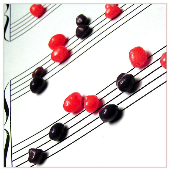
I was worried that people were going to DNMC me for this since "band nerd" is thought of more as a stereotype than a cliche, but it was actually fairly well received! It even survived the validation process, which had me worried when I realized that part of my last minute border color switch had bled into the upper reaches of the photo - I will never use "fill" for that purpose again, believe me... My only other wish for my own photo here is that I could have captured the purple of darker candies instead of this licorice-black they became.
Statistics
Place: 90 out of 288 Avg (all users): 5.7259 Avg (commenters): 6.7857 Avg (participants): 5.3333 Avg (non-participants): 5.9143 Views since voting: 1157 Views during voting: 362 Votes: 259 Comments: 25 Favorites: 2 (view)
Creative idea! I like the colors and the composition. Except that part of my mind is waiting for gravity to take over, and for the candies to come tumbling down. The focus could be a little sharper at the top of the photo. I'm not sure I love the border, although I see the point in adding it, since there is so much white in the composition.
over all a very creative and nicely done entry.
First Impression Nice clean shot
Composition: Very good composition for the theme.
Subject: Sorry but did not like the main subject that well. Not close to the music notes.
Technical (Colour and light): Very good lighting and choice of BG. Focusing is off on the image. The composition is so nice, it leads my eye to the second row and unfortunately the second row is not focused.
Improvement: I like the idea, but did not like the prop. The focusing needs to be improved where ever it force viewer to look for.
Summary:
Creative yes, lighting yes, composition yes, PP yes, subject No, focusing No.
Comment from a member of your own commenting club :-)
First impression 1. I didn't understand the Cliché but I pretended too :-)
Wild guess was that "nerds" is also a word for sweetees.
There are a lot of foreigners on this site. From a small place like Iceland there are 293 people (1 for each 1000) on DPC.
Therefore in choosing title it is better to use simplified text.
2. Good focus on near things
3. Nice idea
What could you do better 1. Upper left corner is dirty
2. Rotate the picture few degrees clockwise to use rule of thirds and make the sweetees inside the picture. In the way you have it the eyes tend to go out of the picture.
3. As you say, purple rather than almost black.
4. I would have liked to see all of the sweets in focus.
This made me smile :) I think you either needed a shallower depth of field, ie. to have more contrast between the foreground and the background, or to have everything sharp.
Color/exposure/contrast: 1/2 overexposed/wrong gamma Focus/sharpness: 1.5/2 foreground not very focused Idea/creativity: 2/2 really nice idea Theme: 0/2 I just don't get it. Don't blame me, it should be easy for everybody. Framing/appeal: 1/2 framing generally good but has an unatural look as if shot from a wicked angle - like upside down, makes me dizzy TOTAL:5.5






 Add photograph to your favorites
 Add photographer to your favorites


 Photographer found comment helpful.


