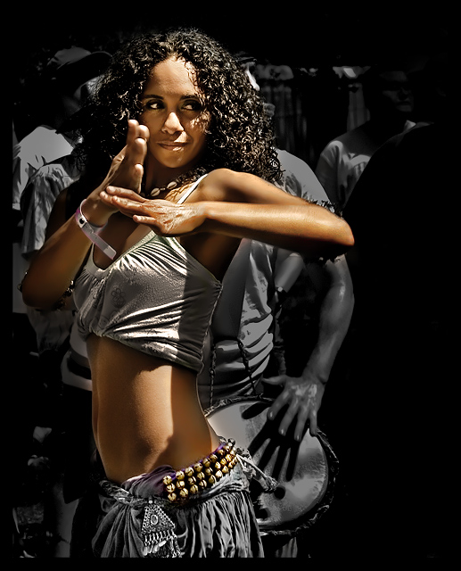
Shot at Austin's Eeyore Birthday Party in the drum circle. I found this to be really dificult to shoot since there were so many people in this tight drum circle and most of the dancers moved really fast.
Statistics
Place: 18 out of 211 Avg (all users): 6.5722 Avg (commenters): 7.6897 Avg (participants): 6.4000 Avg (non-participants): 6.7753 Views since voting: 3525 Views during voting: 504 Votes: 194 Comments: 46 Favorites: 17 (view)
I like how you made her stand out. The contrast workd well
Focus is good and so is the lighting
Its very fitting to the challenge. I almost want to dance along:)
From the CTP MkII
Disclaimer: The following crits are personal opinions, not photographic dogmas. Please see them as suggestions, not claims of mastery nor a show of hauteur.;p
First Impression: Hookay, 5. The first thing that got to me (and I apologize for having to say this) was the sloppy application of selective desat. That, even more than the model (great-looking girl that she is), caught my attention, um, forcefully I guess.
Composition: 6. it's nice that you gave the subject "looking room" but methinks there's a bit too much black space for "looking". Cropping off just a wee bit from the right could make the shot better, IMO.
Subject: 6 or 7. The girl's great to look at so I guess that's all there is to it.;p
Technical: 4 or 5 because the color and desat spills make me uncomfortable. As a "fan" of selective desat, I would've preferred a more careful selection so as to avoid these color and desat spills. And I guess leaving a bit of color (say 15% to 40%) would've sufficed.
Improvement: As I have stated above, a wee bit of cropping from the right and a more careful application of selective desat would've worked wonders for it.
Summary: Dude, 6+ isn't so bad... it's even at the top 20s. So "Grrr" no more, okay? Okay.;p
A beautiful girl always makes for a nice picture! The skin tones came out really nicely in this. The desat makes her 'pop' from the background nicely. I would have liked to see the drummers face maybe (stretching for ways to improve this Ü). Overall this is a great shot. Sounds like you had a really fun weekend!
The girl is gorgeous, with nice color and clarity. I especially like the definition around her shoulder. I scored this at a 7 in voting.
I think this photo probably suffered in several areas. First, from the dead space on the right. Second, she is obscuring the drummer behind her too much - seeing him in the background, even blurred, would have been cleaner and more interesting. There is also the assumption that a photojournalist wouldn't normally selectively desaturate nearly the entire photo (in addition to whatever other process was used to almost plasticize them), though I'm guessing this was done to visually separate the girl from the drummer. Finally, the shadow cast by her arm is a little distracting, though this would be a difficult variable to control in this particular setting.
Comment from a member of your own commenting club :-)
The model is gorgious and you captured her very well.
What is good in the picture?:
1. Lovely colours, you must have edited in that way the other persons are in another colour space or something like that. Enough for my speculations on that but it fits the picture well.
2. Lighting on main subject mostly good.
3. Good focus and contrasts.
What IMO could be better?:
1. The cropping, crop about 6-10mm from the right side.
2. Frame is a bit big and makes again the black space in the right a bit to big.
3. Light on nose on main subject a bit harsh.
Other than that great and a well deserved Top 20 finish.
Congratulations! :-)
This is a great shot Richard. I can see where you had the desat done as it shows as a white line. Anyway, lovely girl too and the desat works all too well ;)
Can't vote, but wanted to comment...
I loved the thumbnail but was a little disappointed when I clicked. She's fantastic and I like the idea of the isolation but for my tastes you took it a bit too far. Now I get more of the impression that she's posed in front a background instead of a part of the action, singled out. For me, it's almost an incredible shot.
Great subject! The selective desaturation feels forced a bit...no doubt in an attempt to get rid of background distractions...just not really working so perfectly. For me, it's an "almost."
This is gorgeous. I love the color and the b&W back. Great light and shadow and a perfectly framed shot. Possibly entered the wrong challenge by accident (or maybe not) but I don't care....9.
Ooooh, beautifully done portrait. Extremely interesting to the eye - the way she is turned out of the frame but looking back into it - it's a remarkable composition. There are a couple of spots, like the very edge of her lower back, that the selective color seems a bit odd, but you're busy being captivated by her face, so you don't notice it much. Very creative, provocative image.
Hot Salsa!!! .... That is an amazing professional-looking image. The light here is exquisite (sun, I presume) The treatment is great - She looks like a diamond among the rough commoners (the baseball hat guy is a nice juxtaposition for me) :) The blur in the hand is my only exrtremely picky criticism because it make the hand look huge. 8






 Add photograph to your favorites
 Add photographer to your favorites

 Photographer found comment helpful.


