This was hilarious. I don't normally pay much attention to the titles but yours was the kicker on this shot. A very interesting subject for a Free Study (I have no clue what other challenge this would fit in but portrait).
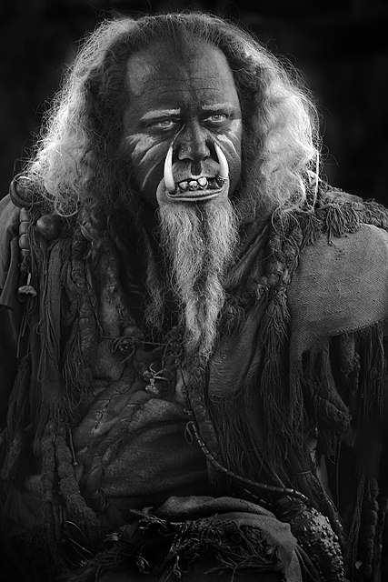
So what can I say. This is a great portrait. Excellent detail through out and the B&W treatment works really well. I would be curious as to what this looked like in color. Lighting and shadows play great. And even now each time I go up to look at it to scrutinize it again it makes me smile - I just cant help but read the title again and chuckle.
I think my only issue with this (and a very VERY small one at that) is that his eyes seemed dodged a bit too much. They seem to bright in the pupil area. But this is such a minor thing (I had to look hard for it).
Congrats on another great score. Just one pic shy of all sixes on your top rated photos. You have been having a really good show of pics lately and I don't expect to see that stop. Well done and good luck in the future.
needs a good health plan :-) The cropping here is a bit strange, cropped too close to the head and there is too much below his head in the picture. Rule of thirds, proportions don't work very well here.
Oh. My. God. That's kinda Klingon-like but not quite. Is this from a film set or a LARP thing? Anyway, it's a great portrait, nicely lit, nicely processed.
This guy looks familiar. Were you at the Renaissance fair? Nice image, but the colors look all very gray. It might be nice to have a little more contrast and lighten the image a little.
What an elaborate costume. The lighting here is really nice...enough to give detail in the clothing, highlight the hair, etc while remaining dark enough to cast some interesting shadows and give drama. Really great job.





 Add photograph to your favorites
 Add photographer to your favorites

 Photographer found comment helpful.


