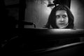
Four years ago, when I was 15, I took a self portrait which has become one of my favourite self-portraits to date. I used my Canon G2 with flipout screen. It was quite simple - just hold the camera in one hand, turn it towards me, compose in the LCD screen, and snap away till I got that lucky shot which I liked so much!
It was for the "Black & White Portrait" Challenge on DPC. Initially it was another shot from the series that I liked best and entered, and I got a respectable 7th place from it, but over time the outtake grew on me. A couple of months ago I decided to enter it into the "Best of 2002" Challenge here, where it also did quite well!
For the Free Study challenge last week, I thought it would be interesting to try and reproduce that shot. I would have a more up-to-date version where I didnt look so young, which could perhaps replace the old one as being my fav, and I wouldnt have to show people such an old picture of me if they wanted to know what I looked like! It was also an experiment to see if I had the skill to reproduct something exactly which was just pure luck the first time around.
It was very challenging! Getting the lighting right was very tricky, since before I'd just placed my desklamp on my bed randomly, and setting my 300D up in the right place on a tripod was just as challenging because before it was hand held. This time I didnt have a flip-out LCD screen to compose on either! After a few attempts I managed to get the pose almost the same, and the lighting roughly correct, but it took many attempts to get it as close as I did in the end. I still don't think it's spot on, especially the placement of the hand, but after such a long time I was getting fed up, and it was the best I had!
So, here are the 2 shots, side by side, so you can all see how I've "matured", hehe :)
Statistics
Place: 32 out of 211 Avg (all users): 6.3587 Avg (commenters): 7.5000 Avg (participants): 6.1584 Avg (non-participants): 6.6024 Views since voting: 1636 Views during voting: 316 Votes: 184 Comments: 31 Favorites: 3 (view)
This is a very striking portrait. I see four elements that complement each other well and give this shot it's intensity. First is the lighting. I very much like how only half of your face is visible. This is the one element that first grabs my attention and pulls me in to find the others. Next is the expression in your eye, it is very focused, as if your full attention is held by whatever you may be looking at. Third, your hand placed over your mouth. This gives the feeling of deep thought, and by covering your mouth, you are hiding any reaction you had to whatever you are looking at. I like not knowing if it is a slight grin, or a more concerned expression. Fourthly, this being a black & white shot adds to the power. This would not work near as well if this photo were in color.
My only criticism, and this is a very small one, is that your cheek is a little blown out. It would be nice to know what shutter speed you used. I think just a little faster would have toned it down just enough.
I came back to this because I knew there was some story I was missing. I didn't have time to vote in the challenge, but I had a quick look through and this one did make an impression.
Having read it, and seen the comparison, I'd say it rocks!
I like the expression and the lighting from a single source. The division of the face down the median adds interest, though I wish the head were tipped a bit more to the model's left to take advantage of the potential for a partial profile there. The hand gesture is difficult to read in the image--yes, pensive and a bit of a press against the lips--but an odd thing is happening with the lower finger. The position and blending of the second finger with the face makes it begin to look like the lower jaw...once that idea occurred to me, I found it almost impossible to shake the strange concept....
Great focus on the eye and detail in the hair. I really like the falloff from light to dark on the right. The light and dark areas are balance very well.
However there seems to be a hot spont on the cheek.
The lighting works really well in the eye area, but the strange play of light and flesh in the nose/mouth leaves me frightened. Dunno why - it's just very strange geometry.
I love the tonality and focus. But the complete black on right side of face creates a harsher feel than the rest of the photograph suggests for me. Some details on right(particularly the eye) may help.
Ahhh, a new favorite image for me! Having seen the "4 years ago" version, I'm delighted and amazed to see how closely you've matched the original vision. Super, fantastic, wonderfully well done. Composition is very strong, lighting is perfect, and that is the most amazing eye detail I've seen since the last one you did. Good luck, Benbo!
Ha ha haaaaaaaaaaaa ha. CUT YOUR HAIR, BOY! Man, you look scruffy. And that lighting is making your nose look shiny. But don't worry. Your cyberaunt loves you even when you need a hair cut. HUG!
I really like the look of his eye and side of his face. I find the out of focus fingers a bit confusing. I think they take away from the quality of this photograph.
I'm not getting the title. I think this is a nicely executed portrait and I love the perfect shadow down his face. The only thing distracting for me is including the fingers in the photo. I don't think I can see enough of them to understand why they are there.






 Add photograph to your favorites
 Add photographer to your favorites


 Photographer found comment helpful.


