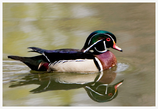
Art really is subjective... this was one of the best photos in the challenge IMO (I gave it a 10). The duck really looks like one of those wooden carvings, and I love the soft, muted tones. The water is like something out of a Monet painting. Really beautiful.
The first thing that stands out to me in this photo is that the colors are quite dull. Since your details are very limited, and tell nothing of the purpose of the photo, nor any editing steps used, my critique will be based on opinion alone, as I have no clue what you were trying for here.
With a duck with this many neat colors, my brain tells me that they should stand out and be 'wow'. However, I do not get this from your photo. I think it might also be that the water is muddy and bland brown. Not appealing at all.
Focus seems soft on the duck. I would like to see crisper focus to help bring out details. Especially in the wings and face. The surrounding water, being wavy, I think only magnifies the look of being out of focus/soft.
At first I felt that the crop was off, but looking further at it, I think you did a good job where you placed the duck within the photo. I like the small bit of negative space at the top, and in front of the duck as well.
The reflection is very nice.
Overall, I think it's an ok image. It just seems to be missing something to give it that wow.
~Heather~
Very nice! It almost looks like an Audubon watercolor. It would need more detail in the feathers for that though. I find myself wondering how you got that brushed look on the surface of the water.





 Add photograph to your favorites
 Add photographer to your favorites


 Photographer found comment helpful.


