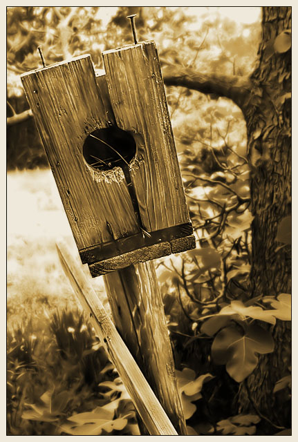
This was the sepia version of my old submission. I liked it better, but thought that the color would do better with the voters on here. I even ran the two through a critique site, and those guys liked this version better. For that reason, I was sure that the voters here would prefer the color. What the hell do I know. Thanks for the comments!
Parts of a whole. I like this series of architectural parts. The detritus of life (like the discarded monitor on a NYC street you recently commented on) provides some interesting juxtapositions at times. It is a sort of commentary on life in itself.
It baffles me that your color shot of this in the challenge barely made a 5. Ridiculous!! This treatment may have fared a wee bit better with the sepia treatment and all.





 Add photograph to your favorites
 Add photographer to your favorites

 Photographer found comment helpful.


