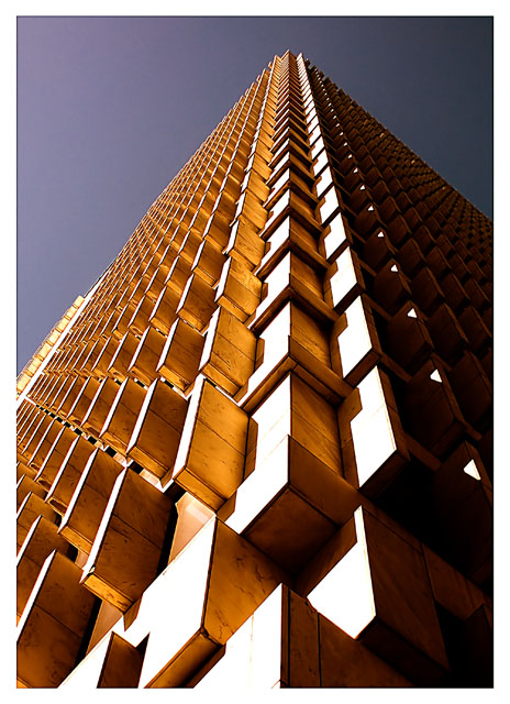
This is one of the older buildings in the downtown area of Atlanta. I had taken a shot before on the right hand side of the building you see, and my intention was to take that one again. The time of day was just a bit different, but the lighting was way different. I messed around for awhile, looking up and drawing attention to myself before I decided on this composition. I like it, but who knows how it will do. Thanks to all for looking.
Statistics
Place: 7 out of 208 Avg (all users): 6.6234 Avg (commenters): 7.2667 Avg (participants): 6.3289 Avg (non-participants): 6.7677 Views since voting: 2366 Views during voting: 314 Votes: 231 Comments: 29 Favorites: 3 (view)
This is a great image, evocative of rhythm, that uses the artificial tilt caused by photographing "upwards" objects to great effect. Everything from the full depth of field to the sharpness, shadows, and colour work excellently. I think that side of the building that's in shadow works well to contrast with the highlighted area in middle, and the lighter tones at left. The sky has a great dark to light gradient that really satisfies. Well done.
this is a nice lmage, but I think you should have waited a few hours before shooting, that bright sun burns out to big part of the image wher you could have great details if you'd wait for the sun to go away :)
this one is just great. i guess you are proud of your placing. well done and congrats.
the only thing i see is the sides that are burnt out. i think that kept you from ribboning. this is a great shot and perfectly, beautifully meets the challenge except for the little burn out. with that fixed definite ribbon dude.
This is a great photo, ,and i think you've composed it perfectly, with the different angles and the slight off-centredness of the main corner. The colours of the sky and building complement each other well, but the sky seems a little dark, and flat.
Personally I'd prefer a touch less contrast on the building, so that the bottom front is not so blown-out.
Congrats on the placing, and an awesome photo for the challenge,
A terrific find for this challenge and captured at the right time of day to create its lovely sweeping rhythmic feel. Congratulations on your top ten finish.
Trading Post -
Way to go - front page and that cool star by your title. Congratulations on a great score and placement. Very cool shot of a very cool building. The angle is great and just makes the lines, highlights and shadows work all the better. I have no comments on how to make this any better. Very nice work.
Trading Post comment
Awesome, Eric! This one grabbed me right away, but I don't always comment during voting on those I figure are going to finish well - I figure they get enough comments. Great lines and good balance of the sunlit side to the dark side. Very well seen and well executed. Congrats!!
EXCLLENT use of light and congratulations on the finish! Not really much critique to offer except that the sky color is a little bit dark; however, it still works very well.
This is superb! The angle, light, detail, and dramatic upsweep of the building all work so well together. Use of light is especially notable. I have absolutely nothing negative to say, or even suggestions for improvement. Your top ten finish is clearly warranted!
Top ten, extremely well deserved. Congratulations on your new excellent work in "Up, up and away" this is an amazing piece in the Rhythm II challenge.
The overall image just grabs your attention. The pattern is obviously are very interesting, especially from this angle. At first glance I thought Jenja (that game where you stack the wooden blocks) but upon closer look realized it was a very intricate building. The composition is just wonderful, placing this subject just off of center works for me.
It must have been a sunny day to capture the much sun from the left side. The sunlight really brings out the pattern, great job! I look forward to your future entries.







 Add photograph to your favorites
 Add photographer to your favorites

 Photographer found comment helpful.


