Author Thread
Post actions
Post actions
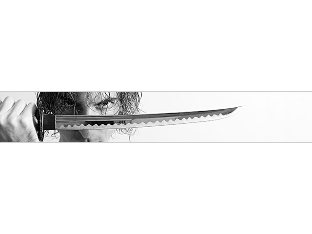
This i awesome. The crop is awesome and works perfectly. This should have scored MUCH MUCH higher.
Post actions
Amazing. Try to get a katana and redo this. It will look awesome.
Post actions
great take on the challenge..love this crop...suits the shot perfectly..
Post actions
original and daring. Something new is refreshing on this site where many themes get overdone. I made it a fave.
Post actions
Originally posted by goodman:
no way, i thought this would be in the top 5
Post actions
no way, i thought this would be in the top 5
Post actions
Congrats on doing so well. As someone else mentioned, such extreme borders are very tricky with the DPC crowd.
Comments Made During the Challenge
Post actions
Original presentation which creates an impact on the viewer.
Post actions
Like the picture and the layout really makes it stand out.
Post actions
Nice interpretation, simplistic but essential.
Post actions
Great shot! the combo of the eyes the position of the sword work well. And the crop and frame are perfect additions to finalize the shot.
Post actions
Simple, emotive, powerful. Not too original but, then again, that wasn't really the POINT was it?!?
Post actions
IMO, this is almost a great shot. For me, the thick "borders" don't help. I think I see what you were going for but I don't think it quite gets there.
Post actions
Refreshingly different. Well done.
Post actions
Post actions
The border is very distracting. Other than that, nice shot.
Post actions
I like your Pano look here...good choice for B&W also
Post actions
The shot looks very artistic, the white space is a bit distracting though.
Post actions
very creative and well photographed
Post actions
Your choice of crop is very dramatic. Good job!
Post actions
I really like the use of the border - bold, creative and refreshing!10
Post actions
don't like this one at all, but it is original, so you get a 6
Post actions
this will be interesting if it qualifies for basic editing
Post actions
Very brave composition and framing. I hope this does well.
Post actions
Post actions
Post actions
This is a very striking image. Wish there was more of it. It's very much overpowered by the wide borders. The concept and the lighting are well done.
Post actions
The shot itself is good. The frame is very distracting.
Post actions
Post actions
nice. very powerful imge. i also like the crop. a 9 from me.
Post actions
This is a great idea and, dare I say, a well 'executed' photo.
Post actions
Your border is overpowering, your photo is too small to porperly judge. It looks cool but it would not be fair to other larger photos to give this high marks. Many photos will look good at this size but at 640x480 would show flaws.
Post actions
brave use of empty space/border. works for me .7
Post actions
Now this is something different in DPC. For me it works, good idea, good shot!
Post actions
surely a ribbon for this! - 9
Post actions
Great composition. I wonder if it would add more mood having the top and bottom black though?
Post actions
WICKED! Me like!
Post actions
Scary - good picture, good saying :o)
Post actions
wow.. makes me whant tp play tekken :) thats a good thing by the way:P
Post actions
Man you are going to get killed in the voting for this but this is SWEET. 10!
Post actions
Post actions
Mehmet? I'm definitely not a fan of frames, but this one works well with the great composition!





 Add photograph to your favorites
 Add photographer to your favorites


