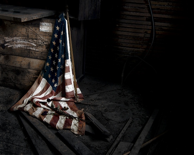
Shot in unused attic space above Buchanan Theatre (used to be boarding house apartments). Old 48-star flag that I found up there and some dried roses that I took with me.
PP included:
crop, lighting/exposure, color sat, contrast, Mr. Contrast filter, dodge/burn brush, save for Web.
Post Challenge:
Thanks for the votes of confidence and another 7th place finish! I wasn't sure how this shot was going to be received, but knew it had turned out pretty close to how I had envisioned it. This outtake is actually how I saw it in my mind, but was afraid of breaking the rules and getting another DQ, so played it safe. Thanks again!
Statistics
Place: 7 out of 183 Avg (all users): 6.8242 Avg (commenters): 8.2083 Avg (participants): 6.4079 Avg (non-participants): 7.1226 Views since voting: 3961 Views during voting: 303 Votes: 182 Comments: 55 Favorites: 15 (view)
Really well done. Great idea to slightly desaturate the flag. Also love the lighting/dodging/burning, and the textures in the wood. Excellent sharpness, too, without any signs of the dreaded oversharpening. It does look like it could be a magazine cover! Congrats on top 10.
Am not normally a 'flag' person but this is a great shot, well perceived and executed and I'm sure it would tug at a few heartstrings, btw, the edited version is even better!
I'm wondering how this would have scored if you didn't title this "(Time Cover)". As it is you still got DNMC votes but probably more without the title.
Beautiful image, I could see it on a magazine cover very easily. This one to me has the balance I am looking for of "great photo" with "looks journalistic". The only thing I might like better is either a little more detail on the right side or perhaps some of the right side cropped off. As it is, there's nothing there, just a 95% black void.
Powerful shot. A little too much burning and shadow on the right hand side. I think a tighter crop oin the right would have been better. Very goo dshot overall.
I really don't like the title. To my mind it should be a title and not an explanation.
That out of the way ... this shot just oozes atmosphere. Dark and faded and grimey, with plenty to look at and ponder. No comment on the politics because this would fit that type of feature perfectly whether you agree with it or not. Top stuff.
I am not a big fan of national flags but I know when I see a good photograph and this is a good photograph, could even be a great photograph. It is what I would expect to find in a magazine like Time. I wish you luck
I certainly hope you didn't place the flag on the ground just for this image. It is a great image, composition, color. . A little off the right side might be ok too, just a bit since it goes black over there and doesn't add to the flag's deteriorated condition. -9- u
Time would run something like this. But, my only beef is - if you are trying to mimick a magazine cover photo, crop it for that format. I'm thinking this image might loose a lot of impact in a vertical crop.






 Add photograph to your favorites
 Add photographer to your favorites

 Photographer found comment helpful.


