Author Thread Comments Made During the Challenge
Post actions
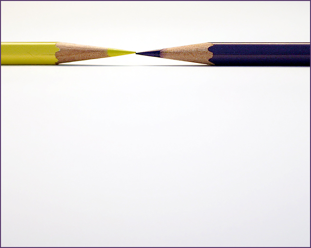
I like your composition, the purple looks more like blue though...
Post actions
Interesting take on the challenge but entirely too much wasted space, need to be cropped.
Post actions
very nice, but the points don't meet evenly
Post actions
Post actions
Ooh, you just missed with the pencils. If the edges were just touching and perfectly symmetrical, which I know is hard to do, but not impossible, it would have gotten probably a ten.
Post actions
Nice light-- interesting angle-- nice job
Post actions
I wish the purple was a little more saturated but the composition is nice and the space works well for this shot
Post actions
almost perfect - very minor thing to match the tip of the pencils excatly would have made it perfect :)
Post actions
I like this actually. Simple and lots of blank space, which really works for this pitcure. I think it could have been better with a brighter blue pencil, but it still is cool.
Post actions
too much deadspace that serves no purpose whatso ever.
Post actions
Post actions
focus is spot on and I really like the use of negative space. My only wish is that the pencils were a bit brighter/vidid. Nice idea well executed
Post actions
interesting shot, good use of negative space
Post actions
wow the white really makes this image pop, great photo
Post actions
nifty idea ... kinda would like to see more.
Post actions
Post actions
GREAT PHOTO I REALLY LIKE THE BLANK SPACE - 8
Post actions
Minimal. Simply. Clean and nice.
Post actions
Oh too bad they didnt align. Still a great shot though ;)
Post actions
Minimalistic, and for that, the point of contact atracts all my attention. Because of that I can see the pencils are not aligned.
Post actions
why is there more of the blue one than the yellow one?
Post actions
very good,I like it. only 1 mm too high the yellow point.
Post actions
Post actions
Good idea. With something this simple, I think it's really important that those two tips actually line up. Like it otherwise.
Post actions
5 - Fairly clean. Like to see the points dead on perhaps, more balance, not sure.
Post actions
Post actions
Very fine minimalism and well executed.
Post actions
it's nice and simple...part of me is distracted by the fact that the two points don't quite line up, and on a shot that is minimalist like this, they really need to be perfect...in my opinion anyway
Post actions
The yellow one is too high by a mm !
Post actions
Nice idea. Too much dead space. The extra dark/light difference is a problem with pigments.






 Add photograph to your favorites
 Add photographer to your favorites


 Photographer found comment helpful.


