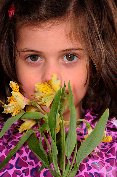
Wow, this is a nice portrait. The clarity is really good and you didn't go crazy oversharpening it like I probably would have. The complementary colors are there but I also like how the pattern on the blouse has heart. Hearts and flowers to me are very complementary so there is that extra element present here.
If you were to reshoot this I would think about centering her in the middle. Right now you have her a bit to the left. If you want to go that route then maybe shoot landscape and have more negative space? However, I do like the portrait style especially how her hair fills the frame. Also, maybe use flowers that are a bit straight. Those look like they are wilting a bit but the color in them is very pleasing. All in all a great photo and one that met the challenge, IMO.
"Hannah" is a nice portrait. The eyes you were able to capture are excellent, they are what really grabs my attention in this piece.
The image is a very pleasing one, even though the pattern on her shirt is pretty wild it still feels like a nice shot. I can see the our complimentary colors in the image are purple and yellow, but I think a lot of voters like myself were more focused on the girl. I might have tried to crop the bottom up a little, but I can see how that might be a concern about losing too much of the purple for the complementary colors. Overall I do think you have a nice shot, unfortunately I think it had a hard time in this category because the girl really does grab your attention.
2 - Like to have seen the colors be the dominant feature in this shot, however a much tighter crop, quality dependent, especially top and bottom, the flowers held a little further away perhaps from the face for a little more 'depth', may have given this a little extra in my opinion. Also perhaps more subtle lighting, not sure.
Skin seems a bit orange to me. The flowers don't have quite the impact I'd like. Sort of ho hum - I'd like some vibrance. The focus and composition are well done.







 Add photograph to your favorites
 Add photographer to your favorites

 Photographer found comment helpful.


