*I am only commenting, and not voting on this challenge*
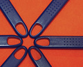
Dark and moody lighting which works well for me. Red/Green is my least favorite of the CC, but this one really works.. it has a shade of green that doesn't knock you over the head, and the red is almost calming. Unfortunately, your crop leaves the symmetry a *little* bit off, which will probably cause people to hit you a bit. Nice photo otherwise.
There is all kinds of noise in this photo, and it is a bit dark too. I don't know what the subject is, and perhaps I'm not supposed to, but the colors are pretty and I want to see more of them. 3
4 - Colors are nice. Obviously dark overall but seems intentional. Your title draws attention to whether this is symmetrical or not, and it is slightly off, but fairly minor. Composition works well. edit:typo
I like this. I like the darkness and subtle colors. My only complain is that, despite the title, they don't seem to be symmetrical but offset to the left a bit. A little trim off the right would help, I think.
Neat bottles. I like what you were trying to do with them. I can't decide if they are just too dark or if it's just right. I think with a little more light you'd make this one pop. But, the way it is is still pretty awesome. Nice shot.






 Add photograph to your favorites
 Add photographer to your favorites


