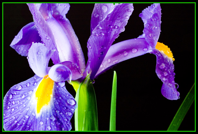
Crisp and clean but I'd like to see more of a balance between the colours in question. Also the composition is a bit questionable - too much weight visually on low-left corner
I think a yellow border would have enhanced the theme of complimentary colors more. And I get a sense the black background is not totally black, or is it just my monitor? Maybe try a curves adjustment layer?
*I am only commenting, and not voting on this challenge*
Ahh, the classic flower on black. Now with water drops!
Pretty nice. Interesting to look at, but the green over-powers the yellow for me, really taking away from the impact of the complementary issue. Of course, that's just me, and since I'm not voting, I guess it doesn't matter much :)
Interestingly enough, the border also contributes to that, and had it been a deeper yellow color.. maybe a bit stronger. Had you tried that?
3 - Good potential. Less greeen, variation in angle, composition and focal point(s), make this better in my opinion. Some of the colors look 'blown'. Also, I see blue/yellow and purple/orange here, so concentrating on one or ther other and slightly adjusting the hue if necessary also. Frame detracts, especially for this Challenge, in my opinion.
wow...this deserves a top 5 or 10 finish...only criticism is I would have liked to have seen the whole petal on the left hand side...bit lovely and sharp with great lighting, well done
I think there might be TOO much to look at and no real point of focus. Perhaps a more shallow DOF with focus on the bottom left flower would've had a stronger impact.






 Add photograph to your favorites
 Add photographer to your favorites


 Photographer found comment helpful.


