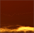
The ceiling at the hospital, taken while waiting for my mother to come out of surgery. The dark square is the actual light fixture. Not good, wasn't taken with intent to enter, but I did like the effect when I played with it and am interested in comments on improving my work.
output levels reversed
increase contrast, saturation
noise, sharpen, resize, unsharp mask, save for web
Statistics
Place: 160 out of 438 Avg (all users): 5.3469 Avg (commenters): 7.5714 Avg (participants): 5.2087 Avg (non-participants): 5.5432 Views since voting: 1143 Views during voting: 287 Votes: 196 Comments: 10 Favorites: 1 (view)
I think this image was underscored. Honestly, I think a 5.7+ is more appropriate. The shapes and rhythm are very strong.
What weakens this most for me, I think, are the 3 blue spots in the black area (the light fixture, I guess). This picture is primarily graphical, and the blue spots distract from the clean geometry. the red tint at the bottom might be unnecessary as well - the color doesn't add much to the photo. the composition is strong enough that it works well as nearly pure tones.






 Add photograph to your favorites
 Add photographer to your favorites

 Photographer found comment helpful.


