| Author | Thread |
|
|
05/07/2006 10:48:10 PM |
Hello from the Critique Club!
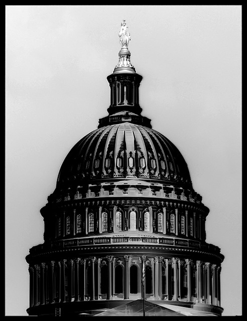
First of all, I had to do a double take when I first saw this image- I couldn't believe it was a negative!
The wonderful tones and contrast make me think of a lovely, velvety smooth bar of chocolate, that I want to indulge my senses in.
The repeating patterns of the architecture, create a wonderful rhythm and are aesthetically pleasing. None of the detail has been lost in the negative version, it's crisp and clean.
Compositionally, there is a lovely balance between positive and negative space.
I can't really fault this! |
|
 Photographer found comment helpful. Photographer found comment helpful. |
Comments Made During the Challenge  |
|
|
05/01/2006 04:50:42 PM |
|
| Photographer found comment helpful. |
|
|
04/30/2006 11:00:42 PM |
|
| Photographer found comment helpful. |
|
|
04/30/2006 08:34:35 PM |
Great Chrome looking Neg.
Good Luck-- 9 |
|
| Photographer found comment helpful. |
|
|
04/30/2006 05:00:04 PM |
|
cool looks sorta like a drawing |
|
| Photographer found comment helpful. |
|
|
04/30/2006 02:37:26 PM |
|
love the look of this - the metal feel is greatness |
|
| Photographer found comment helpful. |
|
|
04/30/2006 07:10:38 AM |
|
Wicked shot, the details really stand out so it was an inspired to use it for this particular challenge. 10 from me, good luck dood |
|
| Photographer found comment helpful. |
|
|
04/29/2006 11:12:56 PM |
|
Nice shot. It's looks like a pencil drawing. |
|
| Photographer found comment helpful. |
|
|
04/29/2006 05:46:29 PM |
|
Works super in the negative! 9 |
|
| Photographer found comment helpful. |
|
|
04/29/2006 10:32:26 AM |
|
Great Shot. The contrast and shadowing really work |
|
| Photographer found comment helpful. |
|
|
04/28/2006 12:31:53 AM |
|
Hmm...great shot, but looks more like a B&W than an negative, sadly. If it were a bit more "negative", I'd score it at the top. As is, I really like it, but can only give it an 8 |
|
| Photographer found comment helpful. |
|
|
04/27/2006 07:19:05 PM |
|
There's another one in the challenge of the dome as well, and their's is just slightly better. I think because they inverted a coloured photo and you inverted a B&W one. Yours is still good though. |
|
| Photographer found comment helpful. |
|
|
04/26/2006 08:56:05 PM |
|
Did I see this scene before on this same challenge ? if not, it's very similar.... |
|
| Photographer found comment helpful. |
|
|
04/26/2006 04:20:30 PM |
|
| Photographer found comment helpful. |
Theme:
Classic /
Light /
Dark
Home -
Challenges -
Community -
League -
Photos -
Cameras -
Lenses -
Learn -
Help -
Terms of Use -
Privacy -
Top ^
DPChallenge, and website content and design, Copyright © 2001-2026 Challenging Technologies, LLC.
All digital photo copyrights belong to the photographers and may not be used without permission.
Current Server Time: 10/15/2026 06:12:37 AM EDT.





 Add photograph to your favorites
 Add photographer to your favorites


