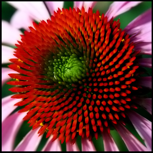
I like shots like this and it meets the challenge, beautiful red and green. I don't know if it is my computer screen but it doesn't look as sharp as it should....don't know???
3 - Good potential. Not sure which scheme you were going for here. I see primarily orange, green and then 'purple', with tiny hints of yellow. Going for either a different angle, using the purple petals more and gaining the yellow, otherwise much tighter and adjusting the hue and using the red/green for the color scheme, not sure. Variation in the composition to gain a little more balance too, plus bigger (640).






 Add photograph to your favorites
 Add photographer to your favorites


 Photographer found comment helpful.


