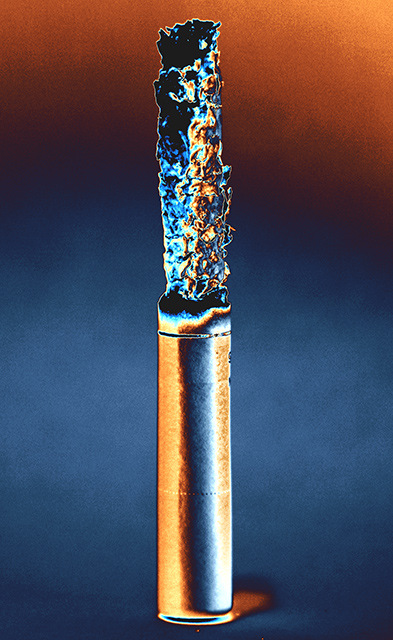
First Impression: NOOKlear! Not quite Warholia, but I don't think that's what you were gunning for. 6.;p
Composition: Centered vertical. It's a bit too compositionally static for my tastes... would've looked for a more dynamic composition for such wild colors. 5, which is the center of all things.
Subject: Ah, cuban? 8... Viva la Cubanos!XD
Technical: 6. For curves and levels overkill.
Improvement: A more dynamic composition, I guess. Off center or diagonal works, for that fuuunky munky effect.
Summary: Nice photo, all things considered. Keep it up!
I like the colours, they work well.
I can't help imagening what the pic would look like in horisontal format? I think it would give it movement.
I can't think of anything else...
Composition: Works quite fine. I can't see this looking any better in another compostion.
Subject: Very fascinating. It has that pop art look. You should probably get this printed out or at least a print version online because this could be something that sells for you.
Technical (Colour and light): The color and lighting are exceptional. The light really gives shape and dimension to the ashes and the color makes it really pop.
Improvement: None really. However, if you tried this again for DPC I might remove that background noise so it looks cleaner and appeal to the neatimage folks, which are aplenty.
Summary: Great image. A strong take to the challenge but most of all creative. Your score doesn't do this justice by a long shot.





 Add photograph to your favorites
 Add photographer to your favorites

 Photographer found comment helpful.


